MacStories Weekly: Issue 408
In this issue: Two BetterTouchTool tips from Niléane for managing windows, Federico shares a shortcut for making multiple shortcut buttons at once in visionOS, John on the damage AI is doing to the web, Jonathan tries a single-day task manager called Today App, plus the usual Links, App Debuts, the latest happenings in the Club MacStories+ Discord community, a recap of MacStories articles, and a preview of next week’s episodes of AppStories and Magic Rays of Light.
Migrating Club Newsletters to Buttondown
Today’s issue of MacStories Weekly is our first issue sent using Buttondown for the email version of the newsletter. We’ve used Mailchimp ever since the Club was first launched, and it is time to move on. Since the company’s acquisition by Intuit, it’s become more enterprise-focused and expensive. But more importantly, it’s never been easy to use.
If you imagine a story with eight images, that’s 16 blocks to paste into Mailchimp’s web app. Add additional clicking around to deal with HTML, links to images, captions, and various other things, and I can tell you as the person who has assembled over 500 issues that it’s a time-consuming, error-prone, and a whole separate parallel process to putting together the website version of an issue.
With Buttondown, the email newsletters you receive will be generated from the RSS feed from the Club website, eliminating the entire assembly process. To say that I’m excited to have those hours back each month would be a vast understatement. I’m also happy to have a system in place that should reduce the assembly errors that occasionally crept into our newsletters in the past.
With the change, the look and feel of the email you receive will change slightly. However, we’ve been able to replicate the design of the Mailchimp version far better than I had expected thanks to the hard work of Robb Knight, to whom I owe a very hearty, ‘Thank you.’
It’s impossible to anticipate everything with a transition like this, so please bear with us if there are a few quirks as we iron out any rough patches. As always, we also welcome your feedback on the newsletters or any other aspect of the Club. Thanks in advance for your patience and for supporting MacStories by being part of the Club.
– John
TIPS
Tips and tricks to master your apps and be more productive.
Two BetterTouchTool Tips for Window Management

Turning the Yellow Minimize Window Button into a Hide Button
Two weeks ago, in Issue 406 of MacStories Weekly, Federico shared a tip for BetterTouchTool that resonated with me. Just like him, I am used to minimizing my windows instead of hiding them, which can be annoying since minimized windows no longer come up when you Command (⌘) + Tab to their app’s icon.
To solve this, Federico used BetterTouchTool to remap the Command (⌘) + M keyboard shortcut to hide a window, instead of minimizing it. While that helps, there was still a small piece missing for me. Most of time, instead of using the keyboard shortcut to minimize windows, I just click the yellow minimize button in a window’s title bar.
Incredibly, after poking around in BetterTouchTool for a few minutes, I realized that the app allows you to change what the red, yellow, and green window buttons do. As a result, I was able to make it so that the yellow button will actually hide a window instead of minimizing it to the Dock.
Here’s how:
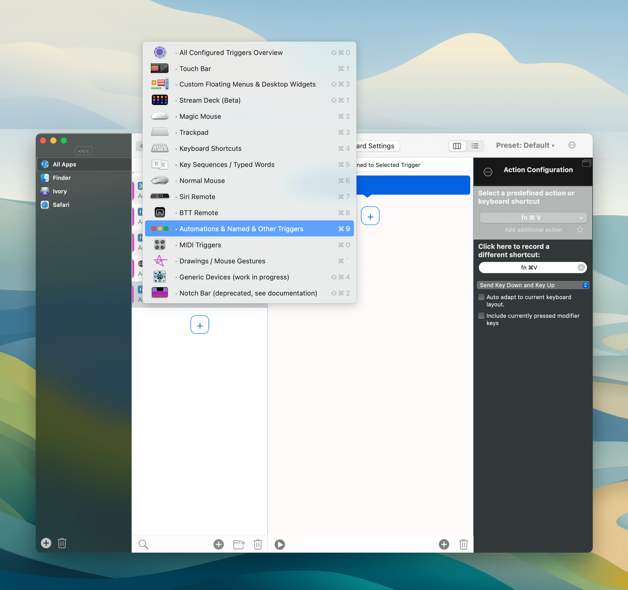
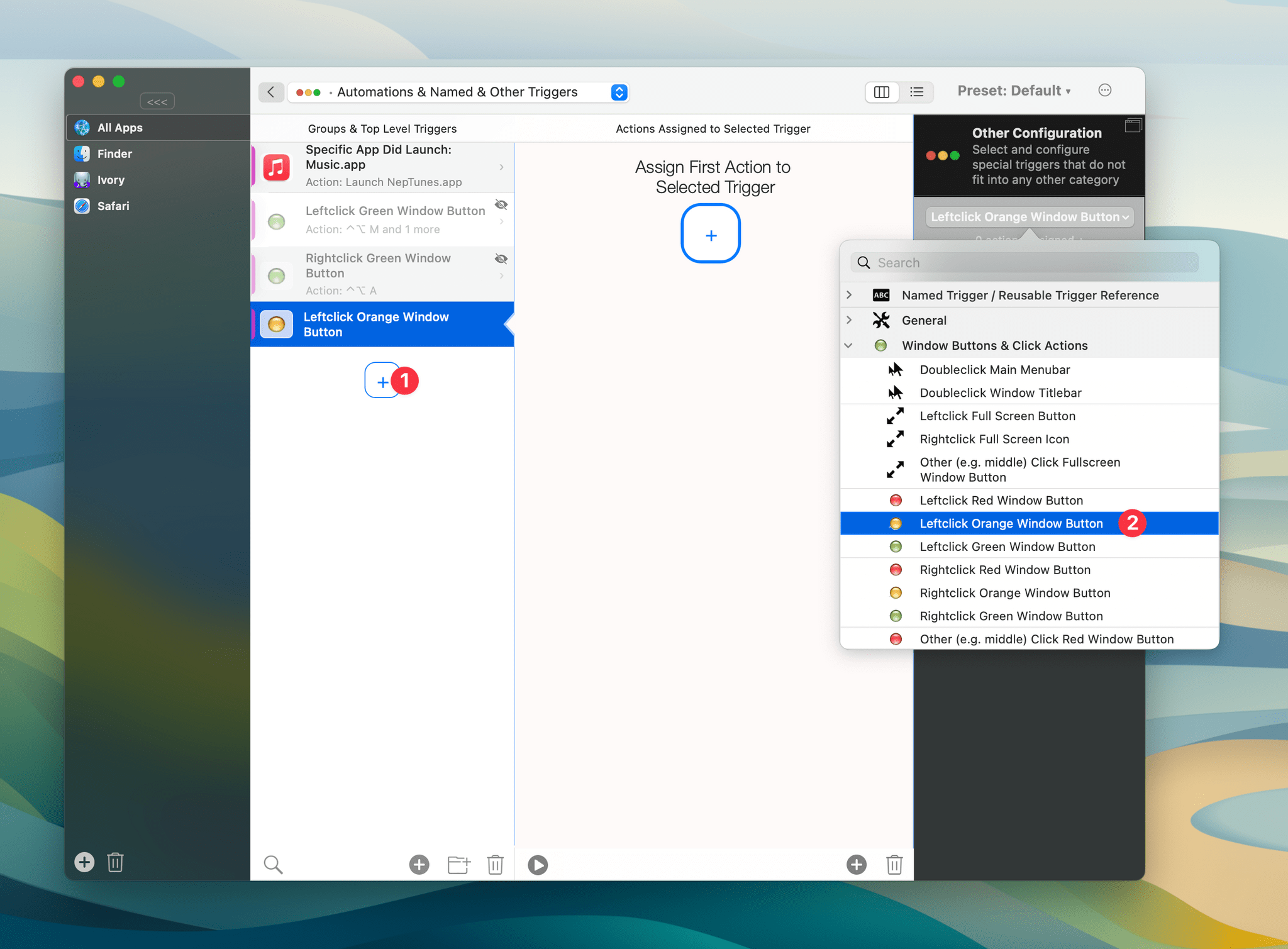
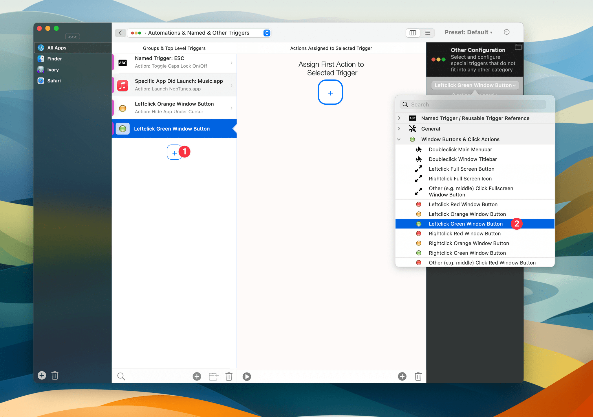
- In BetterTouchTool, go to the ‘Automations & Named & Other Triggers’ section.
- Add a new Trigger, then select ‘Leftclick Orange Window Button’ in the dropdown.
- Add a new action, scroll down to ‘Window Interaction’, and select ‘Hide App Under Cursor’
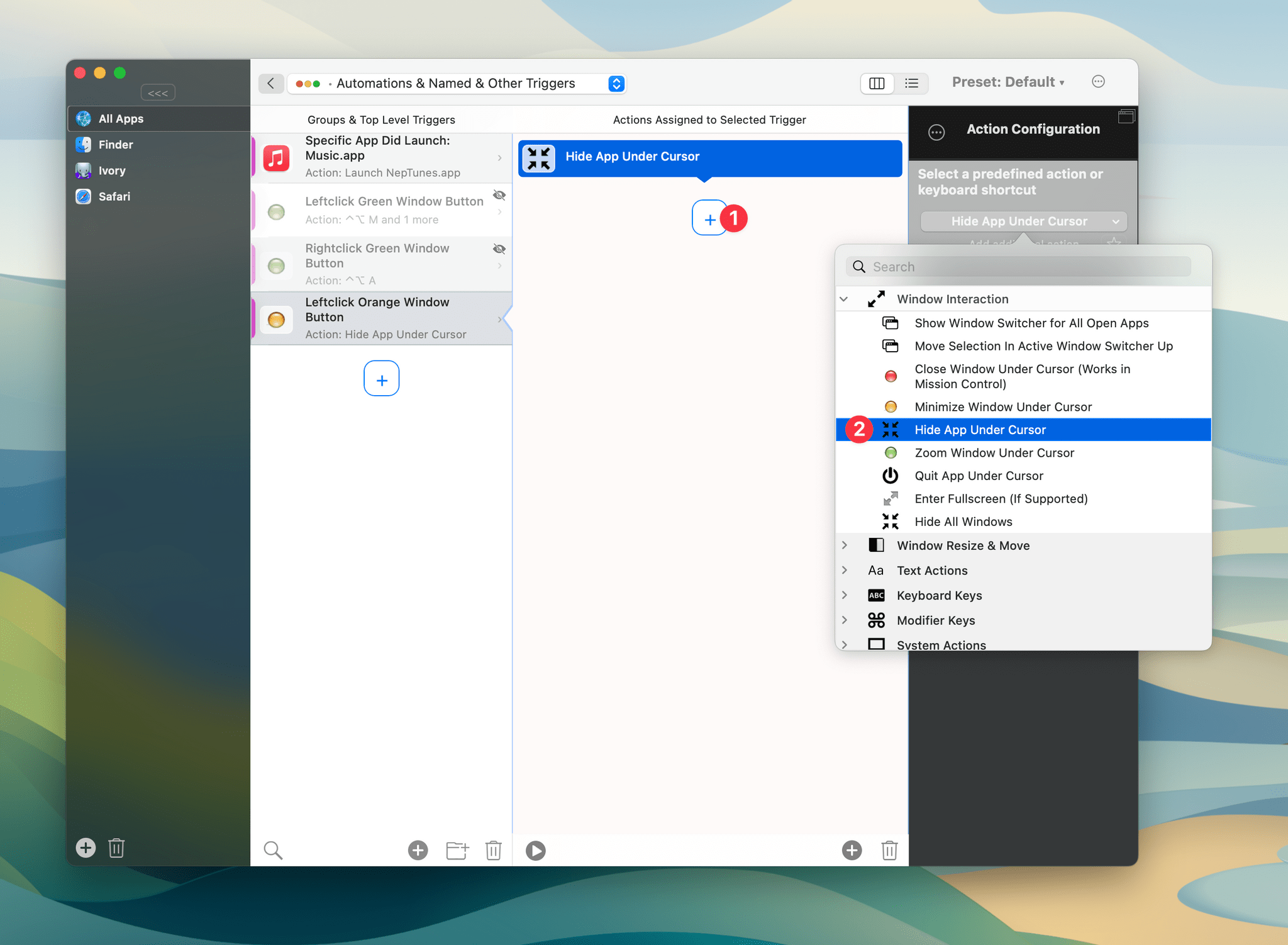
Now, when you click the yellow button in a window’s title bar, you will actually be hiding the window rather than minimizing it, and that window will still appear when you use Command (⌘) + Tab.
Turning the Green Maximize Window Button into an ‘Almost Maximize’ Button
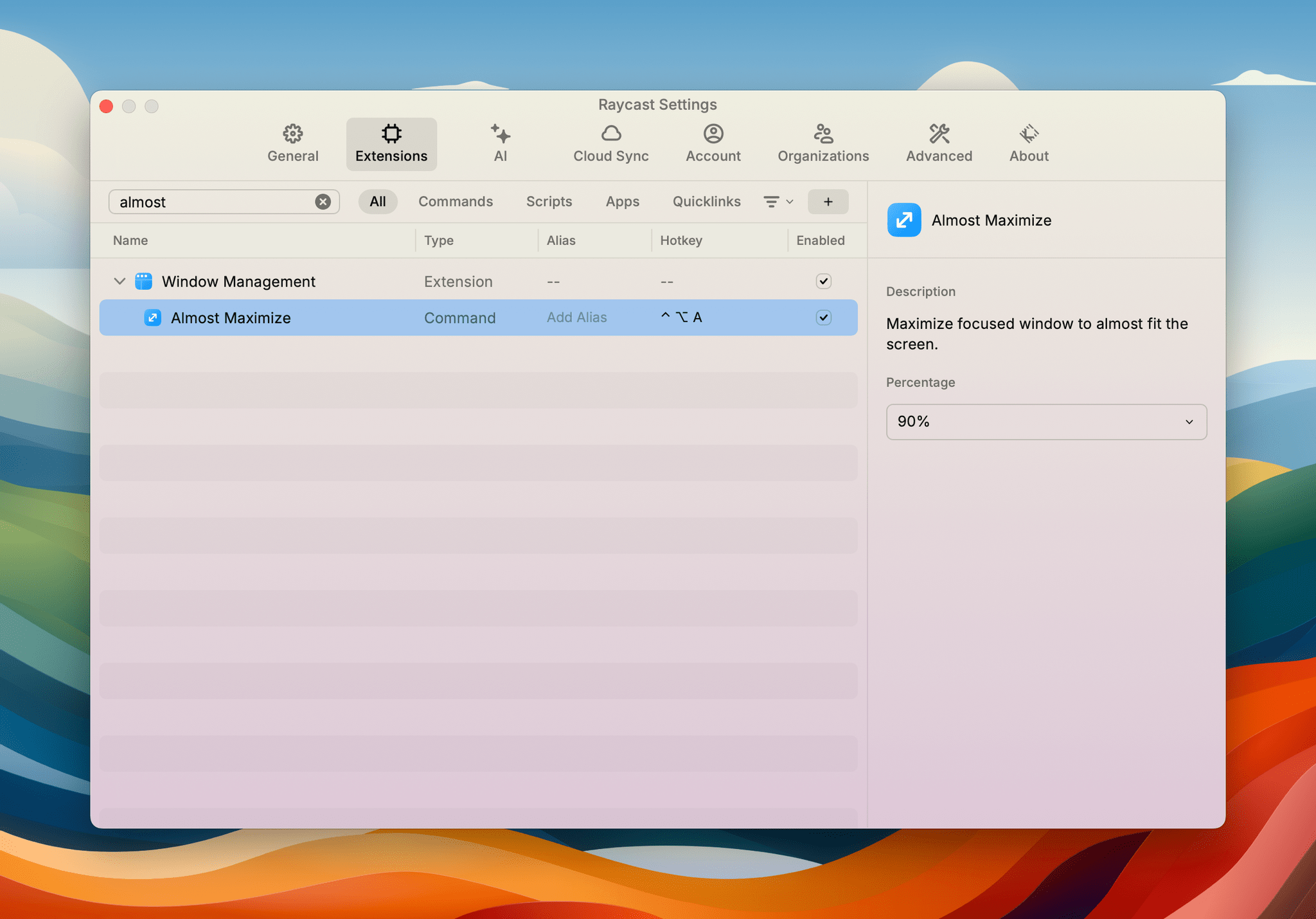
Raycast has a variety of window management commands that are super useful. One of my favorite commands is ‘Almost Maximize.’ This command takes your active window, centers it, and enlarges it to fill a major portion of your screen while still leaving a lot of space all around the window. This is great for when you want to quickly focus on a specific window but still be able to see your other windows around it, as well as your desktop icons.
I use this command so often that I assigned a specific keyboard shortcut to it: Control (^) + Option (⌥) + A. But since I just discovered that I could actually reassign the yellow minimize button to be a hide button, I thought I would keep going and turn the green maximize button into an ‘Almost Maximize’ button using Raycast’s command.
Here’s how:
- In Raycast’s settings window, assign a keyboard shortcut to the ‘Almost Maximize’ command. I chose Control (^) + Option (⌥) + A.
- Now, in BetterTouchTool, go to the ‘Automations & Named & Other Triggers’ section.
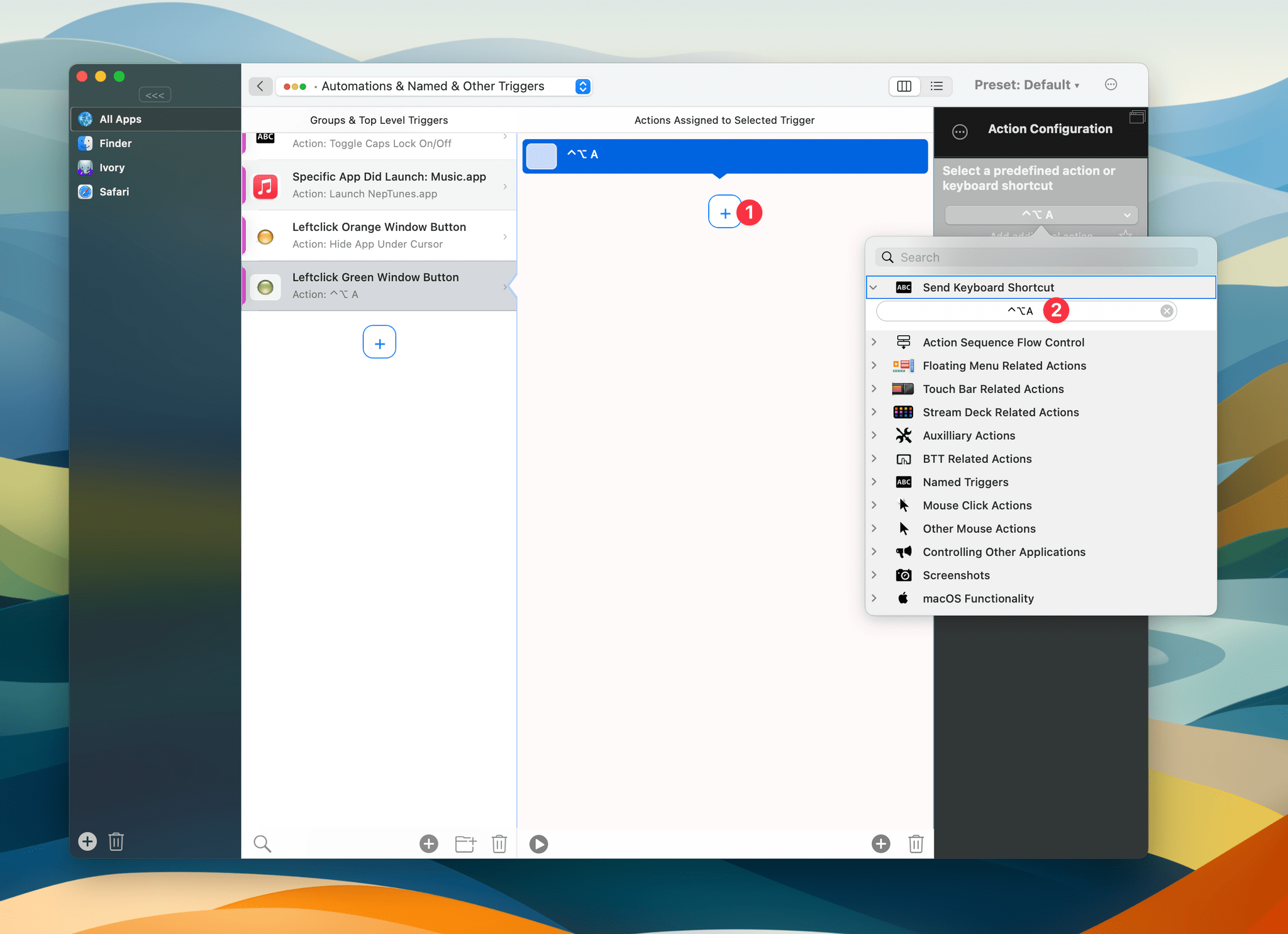
- Add a new Trigger, then select ‘Leftclick Green Window Button’ in the dropdown.
- Add a new action, select ‘Send Keyboard Shortcut’, then press the keyboard shortcut that you just assigned to the ‘Almost Maximize’ command in Raycast. In my case, that’s Control (^) + Option (⌥) + A.
And voilà. Now, if you click the green maximize button, you will actually be triggering Raycast’s ‘Almost Maximize’ command instead of the default macOS behavior.
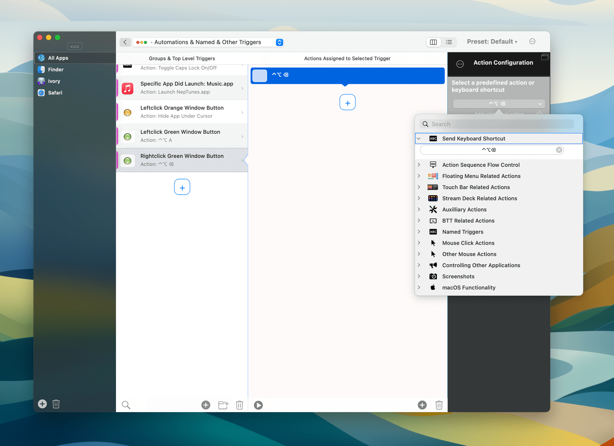
Alright, but what if you want to restore the window to its previous size? Well, Raycast also comes with a ‘Restore’ command which does exactly that. If you repeat the above steps, choose ‘Rightclick Green Window Button’ instead of ‘Leftclick’, and set an action to trigger the keyboard shortcut that you assigned to Raycast’s ‘Restore’ command, then you will be able to left-click the green button to ‘Almost Maximize’ a window and right-click it to restore the window to its previous size!
Here’s the result:
If you have more ideas on how to repurpose the classic macOS traffic lights window buttons, feel free to share them in the Club MacStories Discord. I think there is a lot of untapped potential here that I look forward to exploring.
SHORTCUTS CORNER
Get help and suggestions for your iOS shortcuts and productivity apps.
Shortcuts Essentials
A Shortcut to Create Shortcut Presets in visionOS

Now that visionOS 1.1 has fixed the bug that caused windows to disappear when launching apps with shortcuts, I realized that it was time to start using shortcuts a lot more when working with the Vision Pro. And so, just like I can now have shortcuts that create “window presets” for me with a single tap, I came up with a way to spawn multiple shortcut buttons in my workspace at once. As you can guess, my solution is a “meta shortcut” that makes more shortcuts easily accessible.
If you recall, a while back I reviewed Shortcut Buttons, Finn Voorhees’s excellent utility to create virtual buttons that you can place around your workspace to run shortcuts with one tap rather than having to use Siri or the Shortcuts app. The app is great, but in visionOS 1.0, its effectiveness was hindered by the aforementioned bug that caused windows to disappear if you ran a shortcut that opened something else. As a result, despite liking the app, I didn’t use it much because every time I ran one of my shortcuts, it destroyed my carefully-curated set of windows.
With visionOS 1.1, that is no longer the case, which means I can start taking advantage of Shortcut Buttons in my workflow. However, this brought on a new problem: I didn’t want to manually recreate multiple buttons every time I worked with the Vision Pro.
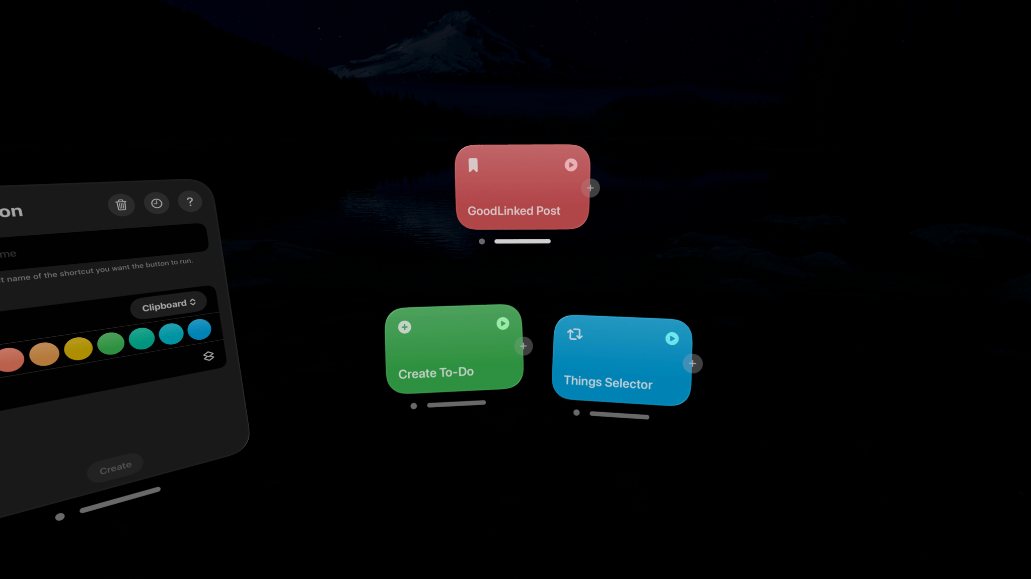
My solution is a shortcut called Shortcut Button Maker, which uses the Shortcuts actions that were added in Shortcut Buttons 1.1 to programmatically recreate buttons with no interaction from the user. In putting this together, I went a step further: I created a shortcut that can spawn a pre-defined selection of multiple shortcut buttons in one go, all while keeping each shortcut’s name, color, and icon intact.
To achieve this, I used a combination of the ‘Get My Shortcuts’ and ‘Filter Files’ actions paired with a ‘Repeat for Each’ loop and the ‘Make Shortcut Button’ action. The idea is simple: After retrieving all of the user’s shortcuts from the app’s library, the shortcut can filter one or more shortcuts that match a specific name. Let’s say that I want to create three shortcut buttons at once. In the ‘Filter Files’ action, I can put in the names of the three shortcuts I want and use the ‘Any’ filtering condition to make sure that, of all my shortcuts, only those three are passed to the next action.
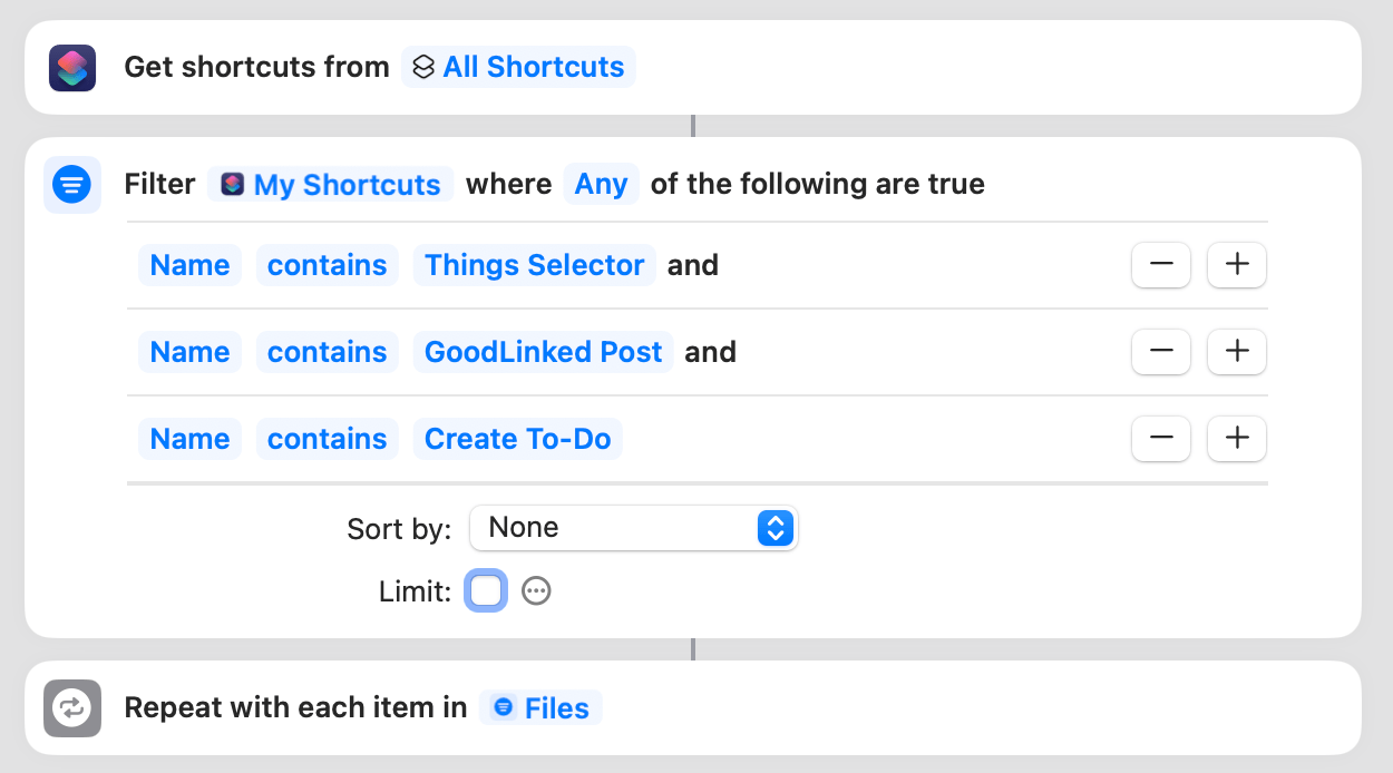
If you want create your own buttons with Shortcut Button Maker, you’ll have to manually change this action to reflect the names of the shortcuts you’re looking for.
After finding all the shortcuts we need, Shortcut Button Maker uses a repeat loop to turn each shortcut into a button for visionOS. To do this, we can leverage Shortcut Button’s dedicated action, which requires that the ‘Repeat Item’ (a shortcut) be processed as a ‘Dictionary’ item. This is necessary for Shortcut Buttons to extract metadata from each shortcut such as its title, color, and glyph.
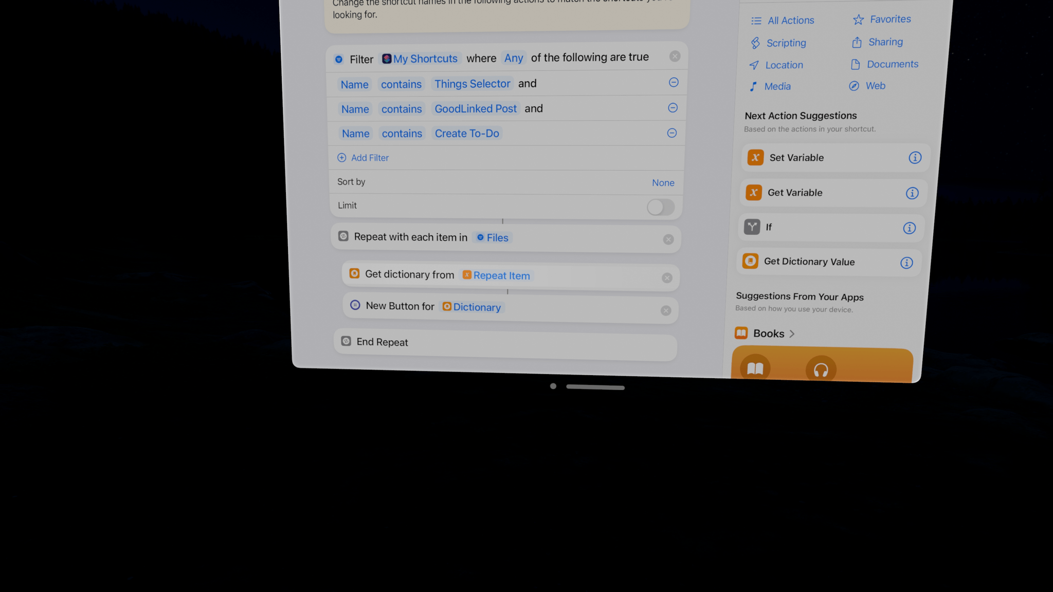
And that’s about it! Once Shortcut Button Maker is all set up and ready to go, just run the shortcut, and boom – multiple shortcut buttons will open in front of you on visionOS:
It’s a small fix, but I’m glad that Apple made shortcuts work better with other app windows in visionOS 1.1. Given the lack of any real window management tools in the operating system right now, every little bit helps when it comes to speeding up the process of launching apps. There’s no better way to do that as of today than Shortcuts, and there’s no better way to run shortcuts in your workspace than the Shortcut Buttons app.
You can download Shortcut Button Maker here.
MACSTORIES EXTRAS
More stories for Club members.
Using Today App to Work Through Tasks Day-to-Day

I’ve written several times before about how I’m working to help myself better focus and organize my schedule. I previously wrote about the app Structured and how it’s helped me to plan what I need to do at various points during the day.
But what about those tasks that randomly occur or are too small to plan precisely into the day? I’m talking about your ‘taking out the bin’ tasks or your ‘pay for childcare’ todos. While you could schedule these throughout the day, they fit better into those pockets of time you find when you’re waiting for a work meeting to start or you’re on your lunch break and feeling particularly motivated.
I could list these tasks in a separate list in Reminders, but I’ve recently been playing with a relatively new app called Today App that allows me to keep them in their own bucket and filter items by the length of time they take to complete.
Recently, a friend told me about a technique they’ve been using for categorizing tasks that has helped them cross off a bunch of chores when they have a free moment. This technique involves assigning each task a ‘length to complete’ tag. They apply either a 5, 15, or 30-minute length to an entry. That way, when they find they have five minutes to spare, they can do one of their jobs that would take five minutes and cross it off the list. Alternatively, if they have 15 minutes to fill, they can do a 15-minute task or three different five-minute alternatives. You get the idea.
This approach appealed to me, so I decided to try it for myself. This led me to using Today App.
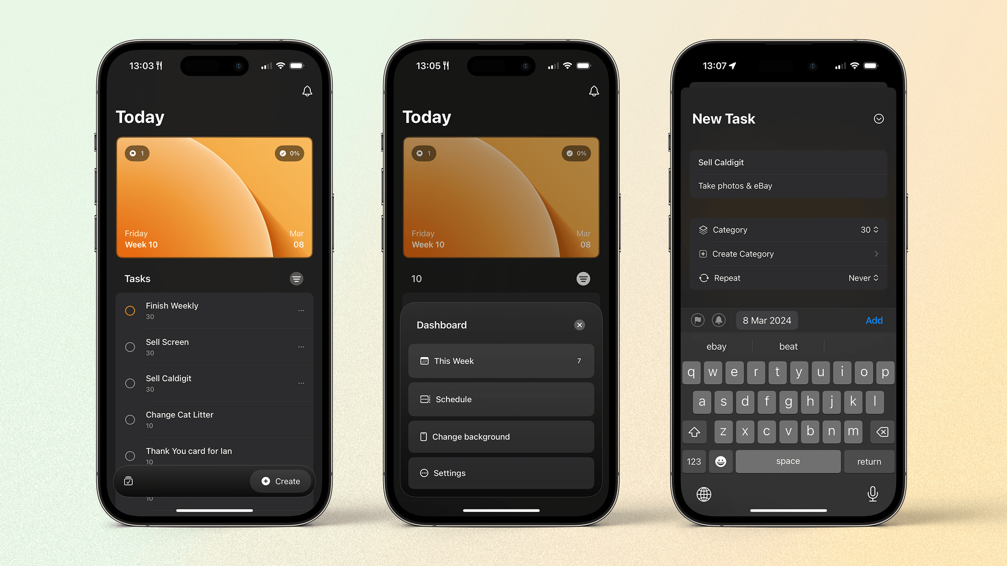
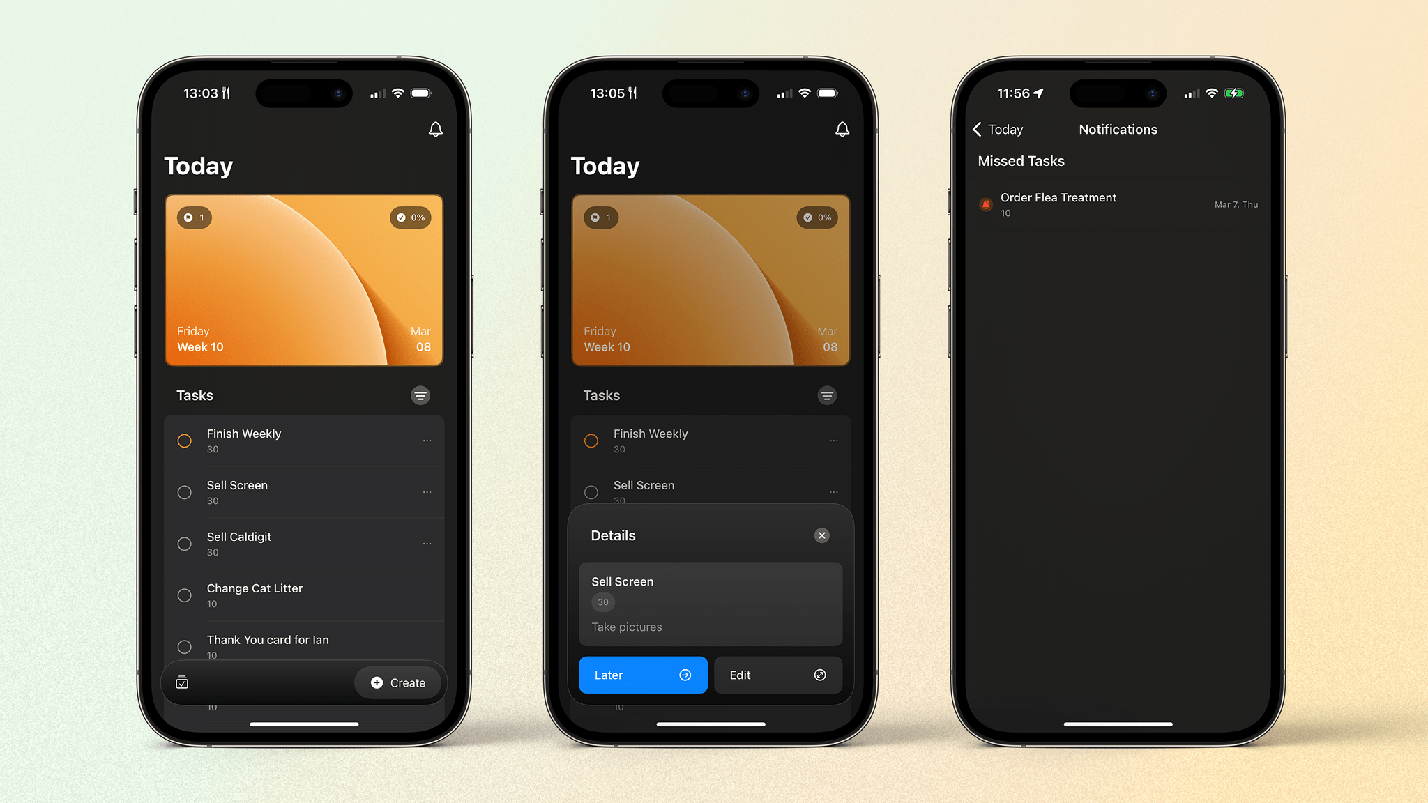
Before I talk about task management, it’s worth discussing the design. With its credit card-like image at the top and list below, you would be forgiven for thinking this was the Apple Wallet app. While I appreciate the different style, having the card so big at the top seems like a slight waste of space. Nevertheless, it is nice to look at.
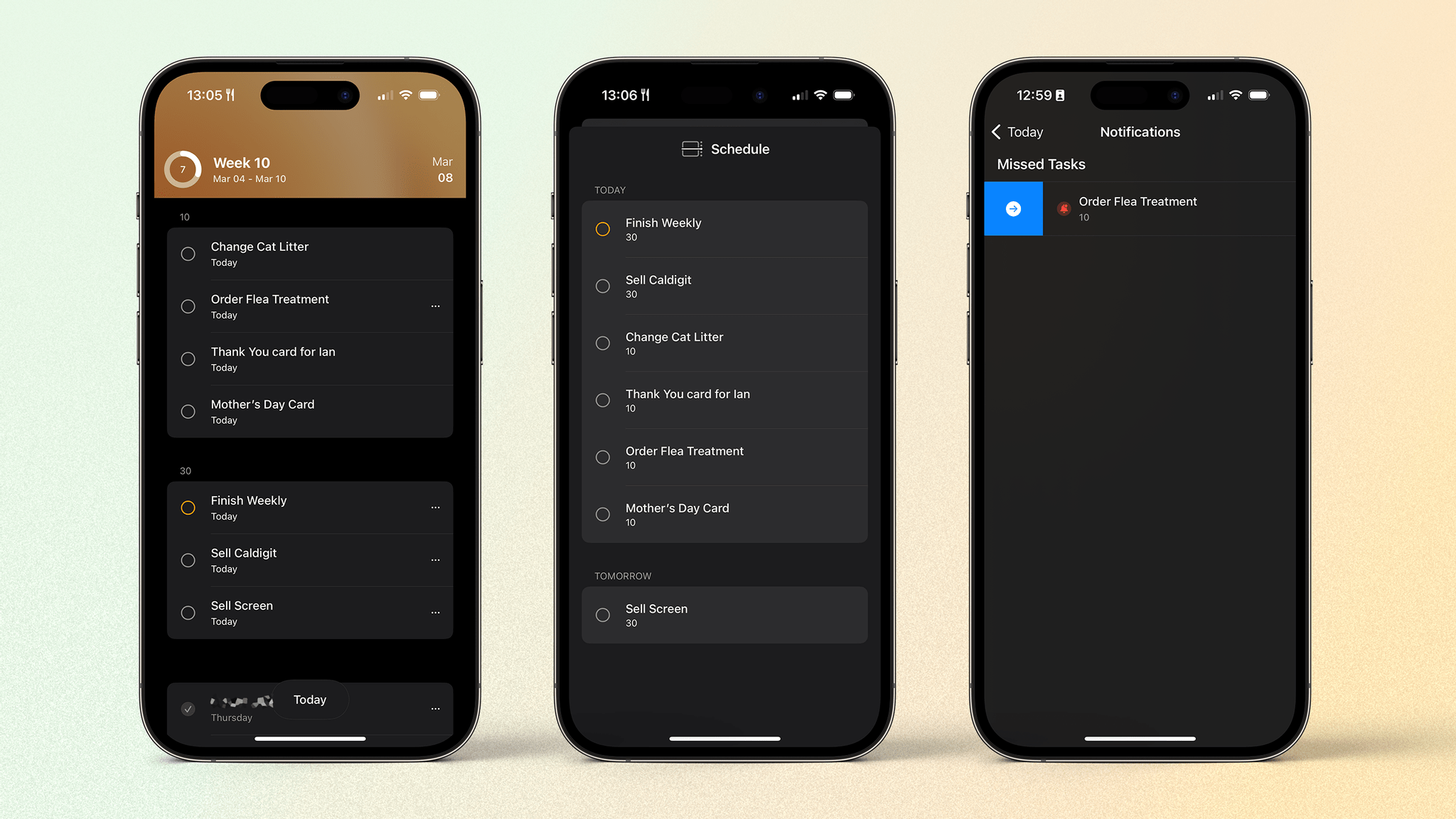
In each corner of the card are different pieces of information: today’s flagged tasks, the percentage of today’s tasks completed, the date, and the number of missed tasks from the previous day. The flagged number is handy for seeing how many tasks must be completed today, as is the ‘missed tasks’ alert, but I largely ignore the percentage completed as it does not indicate the number of tasks left to do. Plus, the idea here is to try to do things when I can and, except for flagged tasks, I don’t need to complete the list each day.
Tapping the card brings up your Dashboard, which allows you to access your week’s schedule and other settings, such as your color scheme, card design, calendar integration, and list of task categories.
Along the bottom is a taskbar that lets you create a new entry or access a recently completed list and a logbook of all previously completed tasks. I appreciate this positioning, and there’s even an option in the app’s settings to flip buttons to the opposite side of the screen if that’s more comfortable for you.
Your list for the day lives between the card and the taskbar. Today App is very much a one-day-at-a-time task manager. While you can schedule tasks for upcoming dates, the idea is to focus on what you can get done during that day with the option to nudge any task to the next day with two simple taps. This action is located in a pop-up menu that appears when you tap on an entry. The menu also includes more details about the task and an edit button to make changes more granularly.
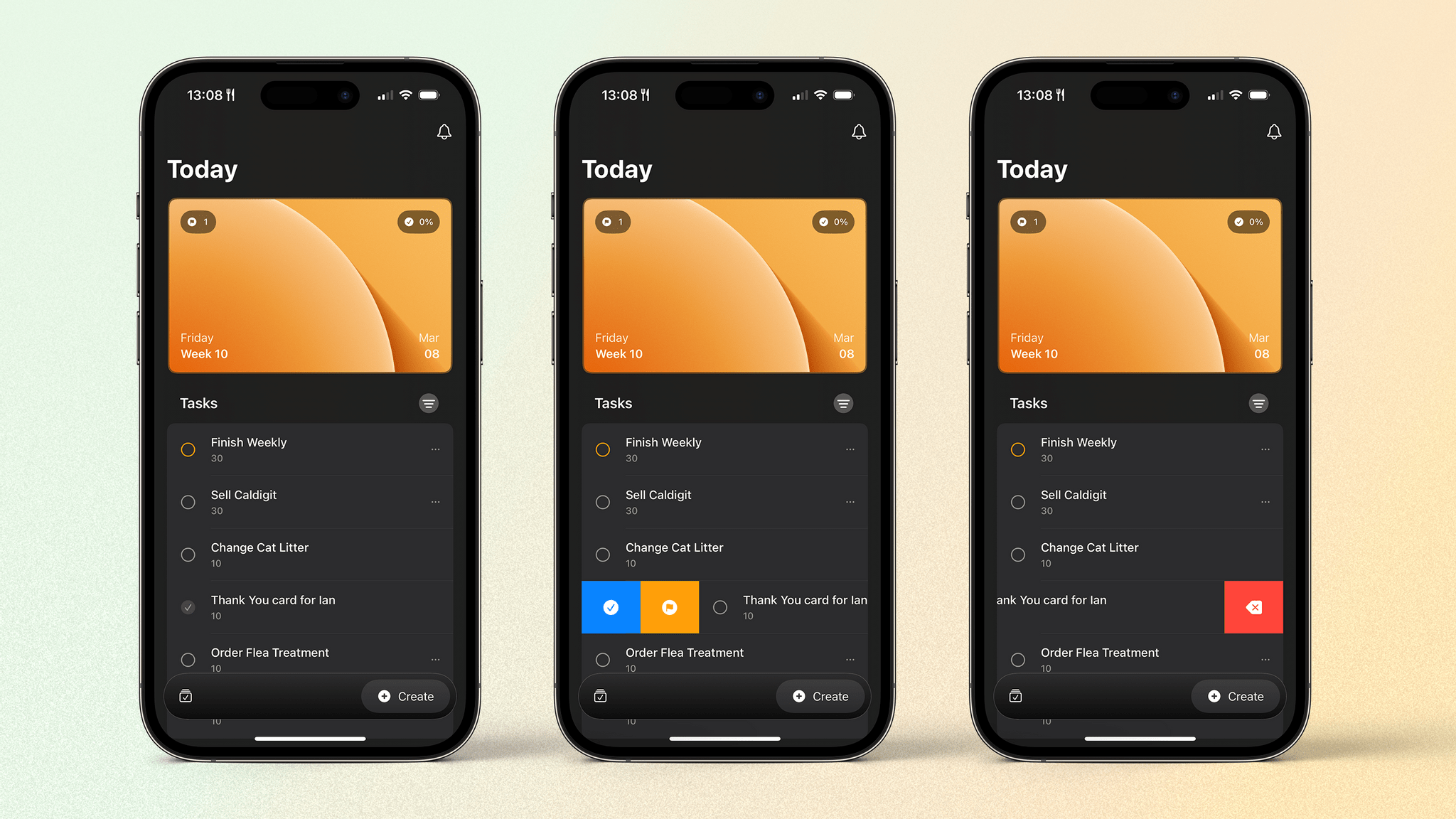
To complete a task, tap the check box on the left. Alternatively, you can swipe to the right to mark it as complete or bring up the option to flag the task as important. A swipe to the left on a given task will delete it. Above the list is a button that allows you to filter by category. This is where the aforementioned tagging technique comes in.
When creating a task such as ‘Sell Caldigit’, I tap ‘Create’ in the taskbar, fill in the title, and add any more information I might need. I can flag it as important if I like or assign a date; otherwise, the task will land in my today view. Then, I assign it to a category. These categories are really just the tags that my friend uses. I ended up using different lengths of 10, 30, or 60+ minutes. For the Caldigit, I need to take a couple of photos and fill out an eBay listing, so I put it into the ’30’ category.
Now, with my list of possible tasks I can do that day, when I have 30 minutes spare, I can use the filter button to only show tasks that take 30 minutes. I can see how many I have in the ’30’ category and pick one to do. Once it’s done, I can check it off and get back to whatever I have coming up next in my day. Alternatively, if I want to get a bunch of small tasks out of the way, I can filter by the ‘10’ category and burn through several 10-minute jobs.
Tomorrow App?
I’m sure I’m not the only one who has trouble figuring out when to do those tasks that are slightly random, too short to assign a time, or don’t really fit into a specific part of your day. The Today App has helped a lot with this, and it’s an enjoyable experience, too, with good design and nice haptics.
That said, a few things are holding me back from embracing the app full-time. One feature I’m really missing is Shortcuts support. The ability to add tasks or reminders in other task management apps with shortcuts is critical to many users; I’m no different. While creating a task in the app is quick and easy, shortcuts are often much more efficient.
Which brings me to other levels of customizability and power use. The simple idea of focusing on today and just completing or delaying tasks means that you can only review items you’ve completed in the Logbook. While this is okay, you can’t interact with any items listed here other than to restore them to the today view. Even being able to specify the completion date would be nice to have, but that isn’t currently possible.
A final feature I’d like to see added is the ability to automatically delay tasks you didn’t complete the previous day to the today view. They could still be listed as ‘Missed Tasks’ as in the current version, but it would save a bit of tapping around the app if they were displayed in the today view as well.
Today App is my first brush with a one-day-at-a-time approach to task management, and I’ve enjoyed it. Why not give it a go yourself? And if you have any other similar apps that you like, please let me know in the Club MacStories Discord.
THE EXTENSION
Exploring topics beyond our day-to-day coverage.
AI Is Strip Mining the Web


Earlier this week, I went on a bit of a rant about artificial intelligence during Ruminate, the bi-weekly podcast I do with Robb Knight. It’s a fun show about the Internet, snacks, and videogames that I’d love for you to check out sometime if you haven’t.
I bounced those ideas off of Robb specifically to work through what I expected would be this column for Weekly. Talking through an idea always crystalizes it in my mind, and in light of Robb’s feedback and hearing from listeners throughout the week, I thought I’d break those ideas down a little further today.
I went into this week’s episode of Ruminate with the notion that no technology in recent memory simultaneously fascinates and repulses me as much as artificial intelligence. That’s sort of true, but the reality is more complex. It’s not the technology itself, but how the technology is being used and how we got to where we are with it, that’s the issue.
I’m not going to survey all the uses of artificial intelligence here, but there’s a lot of good being done in medical research and other scientific pursuits with AI. Closer to home, I’m a big fan of the more natural text-to-speech engines I use to listen to web articles and proofread my writing. However, as we’ve seen with fake political robocalls, there’s harm that can be done when that technology is used for voice cloning, too.
What bothers me the most, though, is how AI companies have been built and the way they’re now jockeying to become the web’s gatekeepers. I suppose that’s not shocking given what I do for a living.
Let’s start with artificial intelligence companies’ origins. These companies have attracted a lot of money and are highly valued partly because they haven’t paid for the raw material on which they’re built. It’s like a car manufacturer not having to pay for engines anymore. It’s not the only cost of building a car company, but it’s a big, valuable one. For OpenAI, Perplexity, and many others, the ‘engine’ they get for free is the web’s content. AI companies’ LLMs are built from decades of creativity and hard work that was made for people, not bots, and that doesn’t seem right.
This is where we get into the whole topic of ‘fair use,’ a legal concept under US copyright law that many AI companies rely on in defense of scraping the web. Fair use is why it’s okay to save an article from MacStories in a read-later app but not to republish it on another website wholesale. That’s an easy example, but it gets a lot trickier with things like LLMs that weren’t around when copyright law was enacted.

I imagine AI companies feel that what they do is similar to Google indexing the web. Google crawls the web, making copies of content it comes across, to index everything for its search engine. And, while Google is certainly not innocent when it comes to skirting close to—or over—the fair-use line, if you’re looking strictly at its search engine, the copies it makes have historically returned some value to websites through discovery.
That’s where I’d argue that AI companies are different. Products like chatbots and summaries of topics and articles are meant to replace the web, not allow users to discover it. Some companies use annotations alongside AI-generated results as a counterbalance, but it strikes me as window dressing to make chatbots feel like search engines, which they really aren’t.
Finally, I want to expand on my comments about the Arc browser. As a browser, I think it has some interesting features and ideas about what modern web browsing can be. Many of those features aren’t for me, but I understand why others like them.
However, I’m not so sure The Browser Company is, in fact, a browser company. Maybe it started out that way, but recently, its CEO floated the notion of making the pinch to summarize feature of Arc Search the default view when visiting certain kinds of websites. Here’s Federico’s 8200-word MacPad story boiled down to four unremarkable sentences:
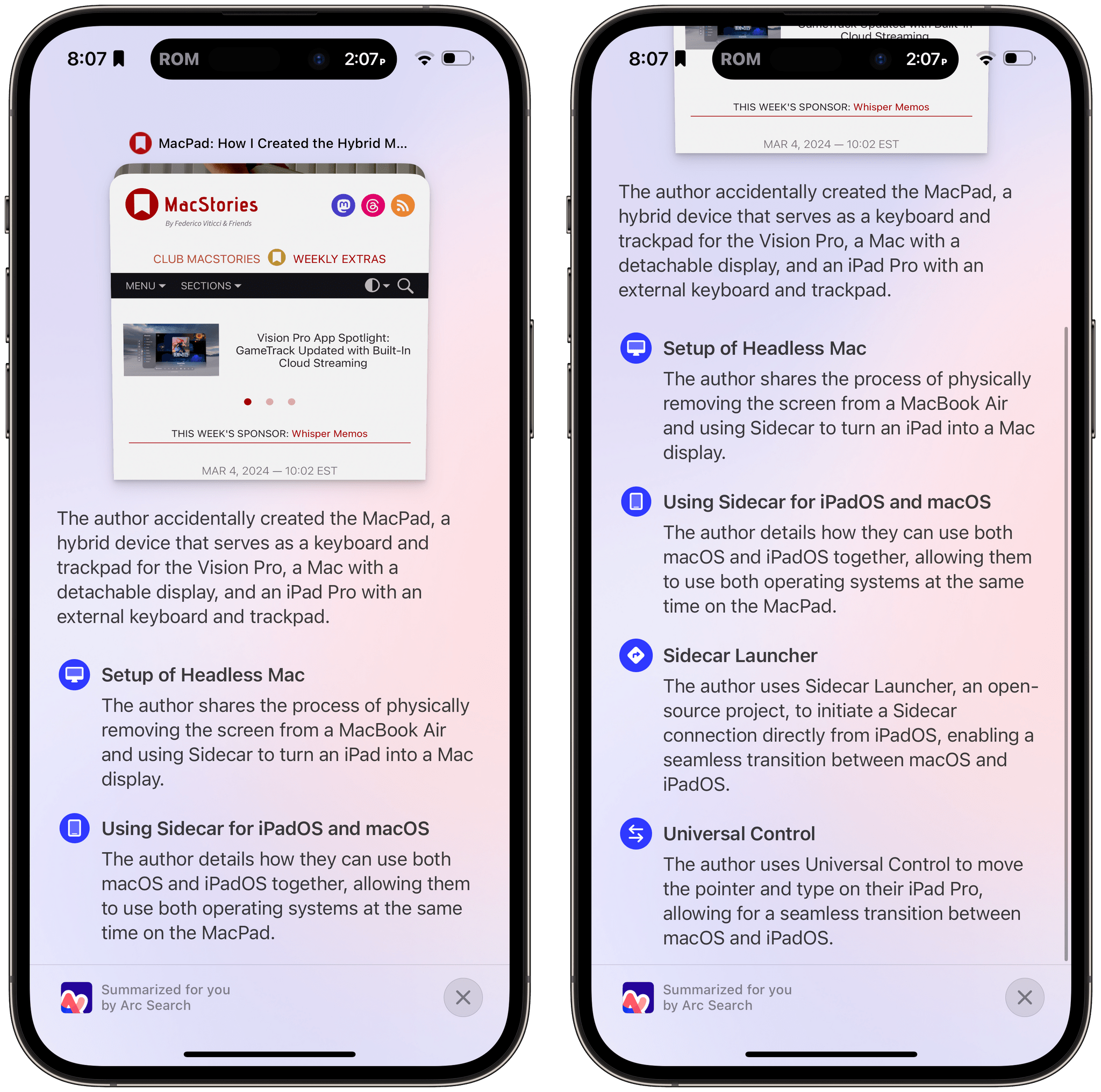
Think about what it would be like for that to be the default view in Arc. It’s not a MacStories.net webpage. It’s an auto-generated page that’s an answer to a question. It’s also a page that’s so far removed from the notion of browsing the web that I’m not sure Arc could even be called a web browser anymore if that were the default view. Instead, it’s a parallel, auto-generated web built on top of the existing web that acts as a gatekeeper to the source material.
It’s that intermediate layer that makes me suspicious of Arc’s motives. The company is starting to feel like a wolf in sheep’s clothing, a browser with an interesting, playful design on the surface and a dark heart lurking beneath. My suspicions are only compounded by the fact that The Browser Company hasn’t so much as hinted publicly about what its business plan is. Does it hope to become the front end for an AI company’s technology? I suspect it does, but no one knows for sure.
I’ll wrap up with something I read recently that Robb linked to on his website by Adam Newbold of Neatnik:
Something to try the next time you’re considering a product or a service: spend a little time thinking about the motive behind it. It’s something that’s easy to skip entirely, especially when we’re busy evaluating a thing by its far more obvious and surface-level criteria. But motive is really important, and I think it can be an effective filter for making good decisions about how we spend our money and attention (and whom we support along the way).
I think that’s pretty good advice and why I’ve let go of the Arc FOMO and put the app aside. I’ll check back in now and then to see if The Browser Company is on a better path, but for now, it’s not an approach I can support.
My thoughts on Arc notwithstanding, I don’t mean to make anyone feel bad about using the app. This sort of calculus is different for everyone. For instance, I still use Gmail, knowing that I’m the product, not the customer. Does that undermine where I draw the line with Arc? I don’t think so, but I’m sure some people would conclude it does.
I suppose this all sounds pretty dire and bleak, and to be sure, it’s not hard to see that the web is at an inflection point. AI spam is flooding the web with junk, and online media companies are laying off legions of people or closing down entirely. Those are real, tangible losses for the web.
However, I remain optimistic that no matter how good AI gets, it won’t ever displace the human creativity that has found a home on the Internet. The web is changing in a fundamental way. Still, perhaps paradoxically, the more AI replaces it with a generic top layer, the more I think people will seek out a more authentic web built by people whose ideas they want to hear and whose motives they trust.
SPOTLIGHT ON CLUB MACSTORIES+
Highlights of the latest Club MacStories+ happenings.
EU and Epic Drama, a New Vision Pro, and WireDrop?
Among the highlights on the Club MacStories Discord:
Lachlan shared a link to an interesting article on PetaPixel about the fact that no commercial cameras currently exist with a resolution high enough to create realistic-looking content on the Apple Vision Pro.
Between DMA-related changes to iOS, the EU ruling on Spotify, and more Epic drama, #apple was busy discussing all of the week’s news.
The Onion always has the best takes, including this article about the new version of Vision Pro.
Andrew asked for help getting started with automations, which led to a great discussion. Do you have anything to add?
You know AirDrop. But what about WireDrop?
Want to join the Club MacStories+ Discord? Upgrade to Club MacStories+ or Club Premier, then visit the Account page.
INTERESTING LINKS
Great reads and links from around the web.
Check out this amazing collection of glassy wallpapers inspired by a retro Apple typeface by Basic Apple Guy. (Link)
The Nothing Phone 2A was introduced this week and got a generally favorable review from Allison Johnson of The Verge for being stylish and under $400, though it is limited to Nothing’s developer program participants in the US. (Link)
Right-to-repair laws have been in the US news a lot over the past couple of years, and Oregon is poised to enact the strictest one yet. (Link)
This Bloomberg article that looks back at Apple’s attempt to build a self-driving electric car is a mind-bender. (Tip: You can get past the web paywall by using Bloomberg’s iOS app.) (Link)
Apparently, the Apple Watch Sport Loop band doesn’t stay on in water, and Darick Langos has hundreds of watches salvaged from a lake in Illinois to prove it. (Link via 9to5Mac)
Our very own Robb Knight showed off the important skill of how to build a Mastodon GIF bot on his website this week. (Link)
Colorware has turned the Apple Pencil into an old-school No. 2 pencil, according to Engadget. (Link)
APP DEBUTS
Noteworthy new app releases and updates, handpicked by the MacStories team.
Funnel
John first covered Funnel’s debut version in December, and the app received a major 1.1 update earlier this week that has added a timeline view to see all notes, images, and tasks you’ve recently captured. This chronological feed allows you to search through your entries and send them again to other apps. Funnel has been on my list of apps to try for months, and I guess it’s now time to put it on my Home Screen for a while and see what happens.
Windora
Windora is one of the most interesting “fun” utilities I’ve tried for visionOS to date. The app’s sole purpose is to create a virtual version of a literal window in your workspace and – here comes the twist – put one of your panoramas inside it. The idea is a genius one: Windora gives you the illusion that you’re looking out a window at beautiful landscapes or whatever else may be in your pano collection. By using panoramas with a wide aspect ratio, you can walk around the window and see more of the photo inside it, just like you can take a peek at what’s going on outside by walking around a window in your house. It’s an incredible effect that you’ll have to try for yourself to see how good it is. The app can be downloaded for free, but with an In-App Purchase you can unlock the ability to tweak window styles, use animation overlays (such as rain and snow), sound effects, and the ability to automatically cycle between your favorite panoramas.
Echodots
Echodots is a color pattern game for iPhone and iPad that reminds me of Simon, an electronic game from the late 70s. The game features one puzzle per day that requires you observe a grid of colored dots as they light up and repeat the pattern. It then shows you which dots you got wrong and gives you additional chances to try again. Echodots integrates with Game Center, offers sharing, and includes a leaderboard. The game is ad-free and can be purchased on the App Store for a one-time payment of $4.99, with optional In-App Purchases that unlock additional features.
NowPlaying
I recently reviewed NowPlaying, a great companion app for Apple Music subscribers. The latest version includes integration with Last.fm, a fantastic addition to to the app. NowPlaying’s SongDisplay mode can automatically scrobble as it detects music through your device’s microphone. You can also scrobble full albums and reflect favorites in NowPlaying as ‘loved’ songs on Last.fm.

Agile 3
Agile is a game from Ben McCarthy that dates back to when they were first learning iOS development. It’s essentially a game of whack-a-mole, but on the Vision Pro, iOS, and iPadOS. Circles light up on a grid one after another at an increasing speed as you play. You have to dart your eyes around the board and pinch the circle before moving on to the next one. I thought this would be impossible to do at a fast pace, but I was surprised at how quickly I got good at tapping the circles as they lit up. Agile 3 is best in short sessions, but I’ve found that it has also improved my efficiency at navigating around the visionOS UI, which is a nice perk.
BitMaps
BitMaps, which Federico covered in Weekly 406, was updated with the ability to open addresses, compass coordinates, and links from both Google and Apple Maps in the app. Michael Steeber’s utility is a wonderful example of the sort of thing Apple should have done with its own Maps app on visionOS.
PREVIOUSLY, ON MACSTORIES
Our top stories from the past week.
Stories
Three Tips to Combine BetterTouchTool and Raycast for Simpler Keyboard Shortcuts
The Best Small Feature of visionOS 1.1
Tapbots Releases Ivory 1.9 with Quote Posts
The M3 MacBook Air: Two Displays, Faster Wi-Fi, and Better Performance
Vision Pro App Spotlight: GameTrack Updated with Built-In Cloud Streaming
MacPad: How I Created the Hybrid Mac-iPad Laptop and Tablet That Apple Won’t Make
Apple Releases New Spring Colors for iPhone Cases and Watch Bands
Apple Introduces New M3 MacBook Airs
The European Commission Fines Apple Over €1.8 Billion
Podcasts
MacStories Unwind: Live MacPad Q&A from the Club MacStories Town Hall
UP NEXT ON MACSTORIES' PODCASTS
A preview of upcoming MacStories podcast episodes.
Next week on AppStories, Federico and John look at Apple’s Sports and Journal apps and visionOS for clues about the design changes that might come to Apple’s OSes with the next major revisions this fall.

Next week on Magic Rays of Light, Sigmund and Devon join the search for John Wilkes Booth with new Apple Original thriller series Manhunt, delve into the Takashi Miike Apple anime short Midnight, and grade their Academy Award predictions.