I Have Very Mixed Feelings on AI. Maybe That’s OK.
MACSTORIES EXTRAS
More stories for Club members.
I Have Very Mixed Feelings on AI. Maybe That’s OK.
Last week, I experienced something that blew my mind so much that it made me rethink my entire perspective on AI. It made me question some firmly held beliefs on the subject in a way I don’t think has happened with any other issue for many years.
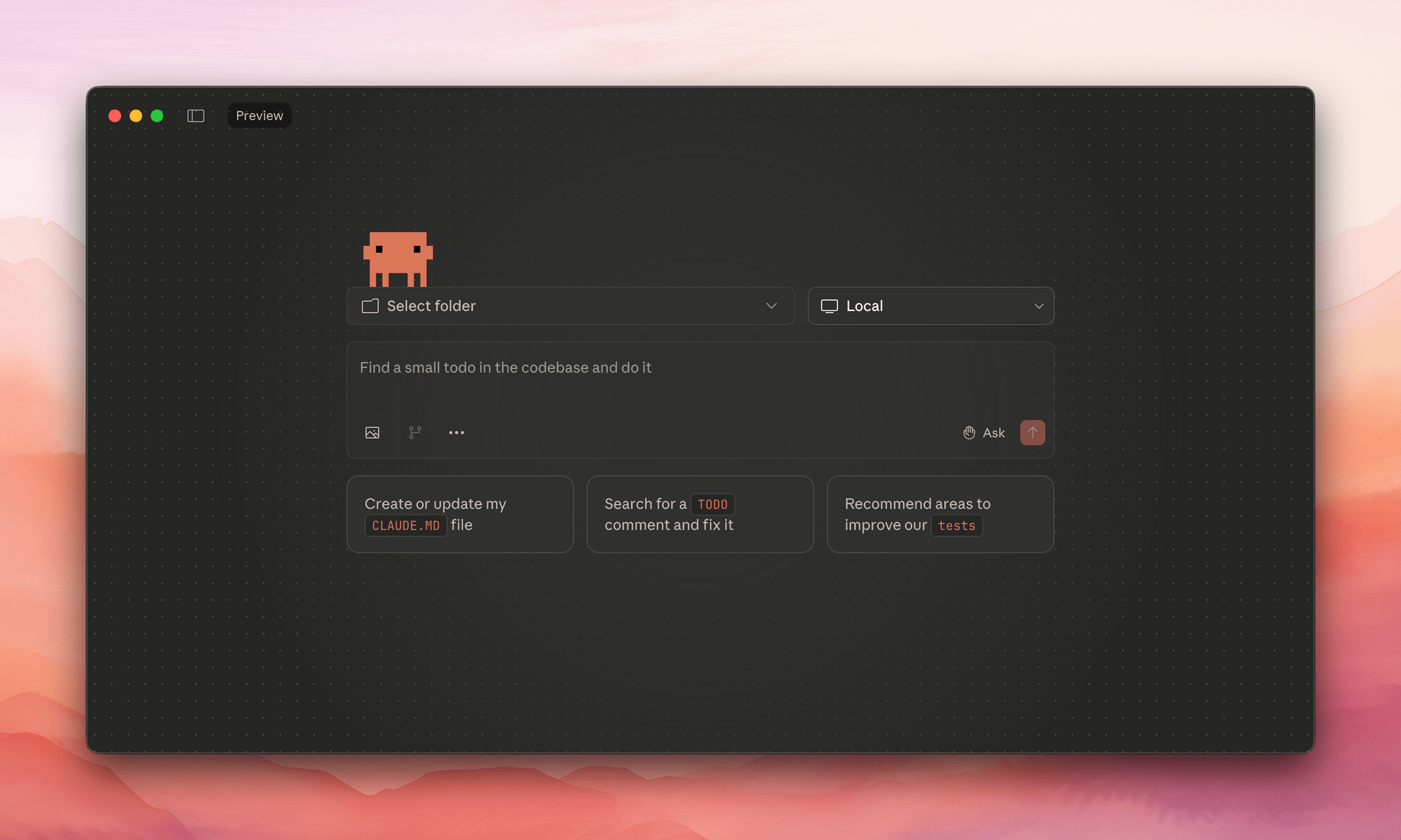
Let’s back up a bit. At the end of last year, Anthropic released Claude Opus 4.5, a model that was instantly hailed as a major step forward in coding assistance. Since then, the hype around its capabilities in this area has only increased – so much so that Google employees are posting things like this: