macOS Tahoe Icons: The Good, the Bad, and the Ugly
MACSTORIES EXTRAS
More stories for Club members.
macOS Tahoe Icons: The Good, the Bad, and the Ugly

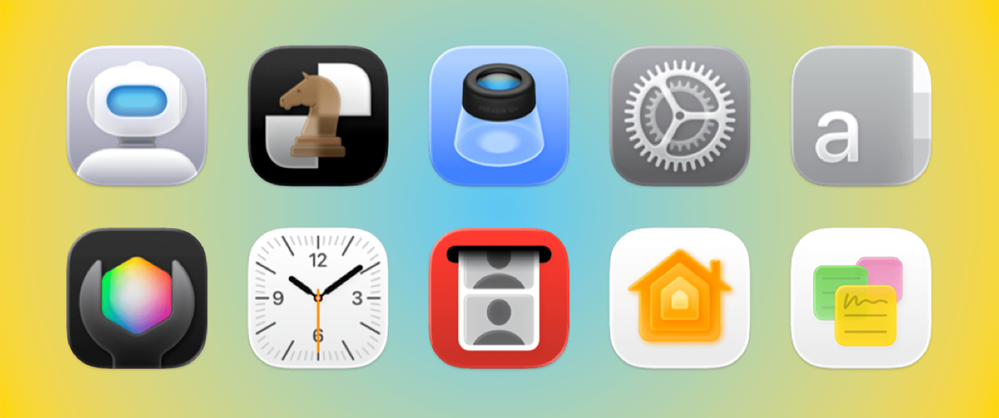
With macOS Tahoe, Apple will introduce a new UI design in line with its other OSes: Liquid Glass. Along with the new UI come updates to the way app icons are presented. While the changes aren’t too dramatic on iOS and iPadOS, icons on macOS will undergo some significant modifications. Most notably, Apple will soon force developers to create app icons that fit the company’s “squircle” format.
Apple has had to do the same with many of its own app icons. As with any change in this vein, there are plenty of examples at both the good and bad ends of the spectrum. So this week, I’m going to evaluate ten of the most notable icon changes coming in macOS Tahoe. Red pens at the ready!
