MacStories Weekly: Issue 285
In this issue: Delta, how John and Federico are using Sofa to track media, John’s iPad Air Home Screen, plus the usual Links, App Debuts, a recap of MacStories articles, and a preview of upcoming MacStories podcast episodes.
MACSTORIES RECOMMENDS
Great apps, accessories, gear, and media recommended by the MacStories team.
Delta
This week’s pick is a little different than usual: Delta, developed by Riley Testut, isn’t an app you can find on the App Store, nor is it a web service that comes with an iOS companion utility or website. Instead, Delta is an excellent emulator for old Nintendo consoles you can only install on your iPhone or iPad by side-loading it via AltStore.
I briefly discussed AltStore a couple weeks back on Connected, and we’re doing a deeper dive on AltStore and Delta in the upcoming episode of AppStories out on Monday. In case you haven’t heard of AltStore, it’s, well, an alternative App Store that lets you side-load (i.e. install) apps on your devices that haven’t been approved by Apple for the App Store. AltStore is made possible by a companion desktop utility called AltServer, which runs on your Mac and uses your Apple Developer account credentials to “sign” apps and install them on your device as if you had previously built them as a developer using Xcode. The workaround employed by Testut for AltStore and AltServer is clever, has been verified by other developers, and the service has an active community of thousands of users who side-load apps on their devices. For the past few weeks, I’ve been one of them.
There’s a variety of apps you can install using AltStore – the service is reminiscent of Cydia, the popular jailbreak store, with “sources” you can add to find even more apps – but I’d wager the single reason why most people get into AltStore is Delta. The emulator, which is available for iPhone and iPad, supports the following Nintendo platforms:
- NES
- SNES
- Game Boy Color
- Nintendo 64
- Game Boy Advance
- Nintendo DS
Having played Metroid: Zero Mission again for the past couple weeks (I just beat Kraid, let’s go), there are a couple things that stand out in Delta for me: its polished, modern design for Apple platforms and its solid performance. For starters, Delta is the spiritual successor to GBA4iOS, another popular emulator Testut created years ago along with Paul Thorsen. Testut has a long experience in this field and was able to create Delta using his own Swift-based emulator framework that enables full-speed emulation thanks to mature underlying emulator cores such as the popular Snes9x and VisualBoyAdvance. This means that Delta is based on proven emulator cores that have been around for decades and have received hundreds of fixes and compatibility updates over the years. I can tell you, for instance, that I played and finished Super Metroid when I was 16 using a version of Snes9x installed on a modded PSP. That’s how long these emulator cores have been around.
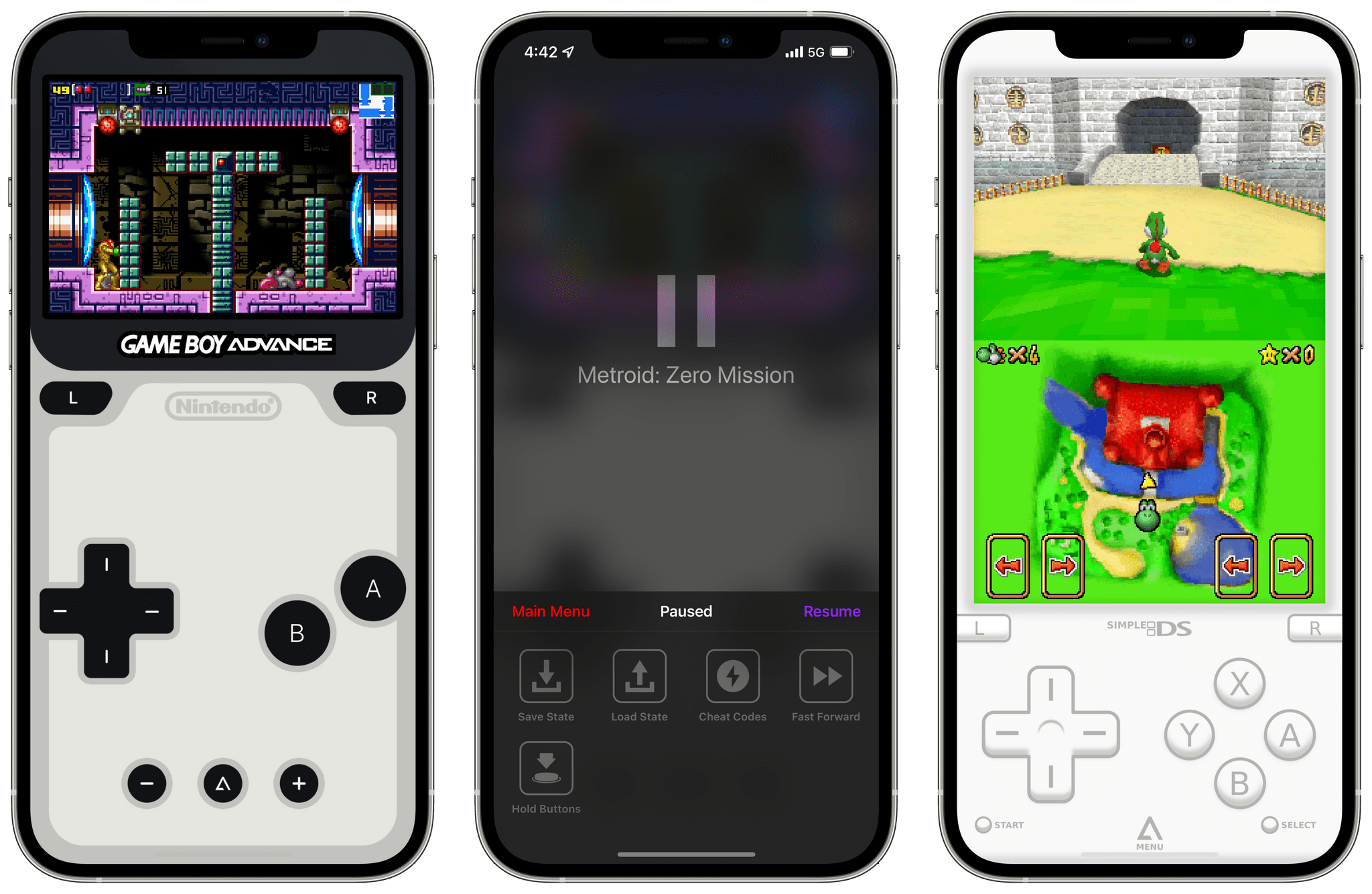
Second, Delta looks and feels like a modern iOS app designed specifically for Apple platforms; it’s not your usual cheap emualtor UI that was put together by someone who likes to tell people on Twitter they should switch to Linux. Delta comes with beautiful pre-installed console skins that replicate the look and feel of Nintendo consoles with virtual buttons and D-pads; if you don’t like the default themes, you can download additional skins from the Internet. It’s the modern iOS features that make Delta special though: as with other emulators, you can save and load your state at any point during a game, but Delta even lets you peek at those states as live previews with a long-press; you can play games with touch and all the virtual on-screen buttons have feedback enabled; you can change each imported game’s artwork using images from the clipboard, Photos, or Files, or you can search using Delta’s built-in artwork database. And then, obviously, Delta lets you play with any compatible iPhone controller, including the latest Xbox and PlayStation ones.
I’ve had a fantastic experience with Delta so far: I appreciate the app’s intuitive UI and respect for Apple’s platform conventions, and its performance has been incredible. In fact, I’ve had a better experience playing Metroid with Delta on the iPhone than I did with Nintendo’s old Virtual Console on the Wii U (don’t even get me started on why the Virtual Console doesn’t exist for Switch still). All this to say: if you, like me, are craving some old Nintendo games, Delta is my favorite way to play them with the modern convenience of an emulator on the iPhone and iPad. I have a long list of Metroid and Zelda games I want to re-play; if Nintendo doesn’t change its mind on the Virtual Console, I know I’m going to play them all with Delta.
TIPS
Tips and tricks to master your apps and be more productive.
Exploring Sofa's Unique Flexibility
One of the things I love most about media list creation and tracker app Sofa is its flexibility. The app’s design is superb, but it’s that flexibility that lets everyone use it in a way that makes sense with the way they organize their media lives. Add the app’s theme system to the mix, and the result is a highly personalized experience.
The adaptability of Sofa was something that immediately caught my attention when I reviewed version 3.0 recently. However, it’s one thing to understand that abstractly and a whole other thing to see it in action, which happened a few days ago when Federico shared his Sofa setup with me. He uses the app quite differently from me, which I thought would be a good way to demonstrate approaches to the app that members might like to try themselves.
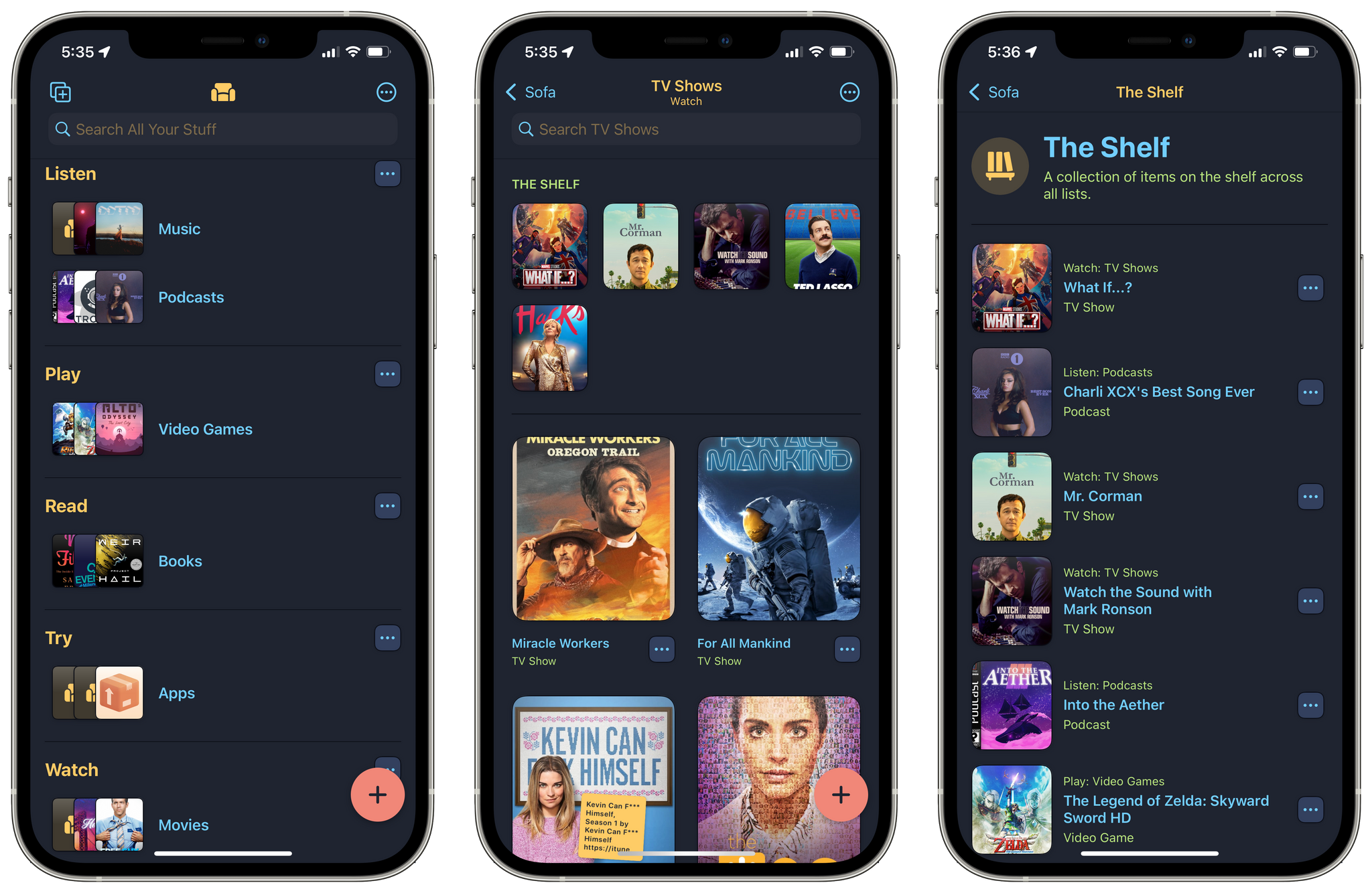
I’ll start with my Sofa setup, which I would describe as an activity-based, contextual system. I have five contextual groups: Listen, Play, Read, Try, and Watch, which each contain a list or two with media that fits into those contexts. Although multiple contexts are usually available to me at any time – like playing a videogame or watching TV – more often than not, I’m in the mood for one of those activities, not both.
Whenever I discover something new to try, I add it to one of my lists. Then, periodically I go through each list and drop an item or two on The Shelf, which serves as my Current/Up Next list. I like that The Shelf cuts across categories, and it’s a pre-selected short-list of what I want to do next.
Also, I’ve been using the Classic Dark theme lately because it’s one of my favorite Sofa dark mode themes. I like the variety of colors, which are well-balanced across the app’s UI elements, especially on the iPad.
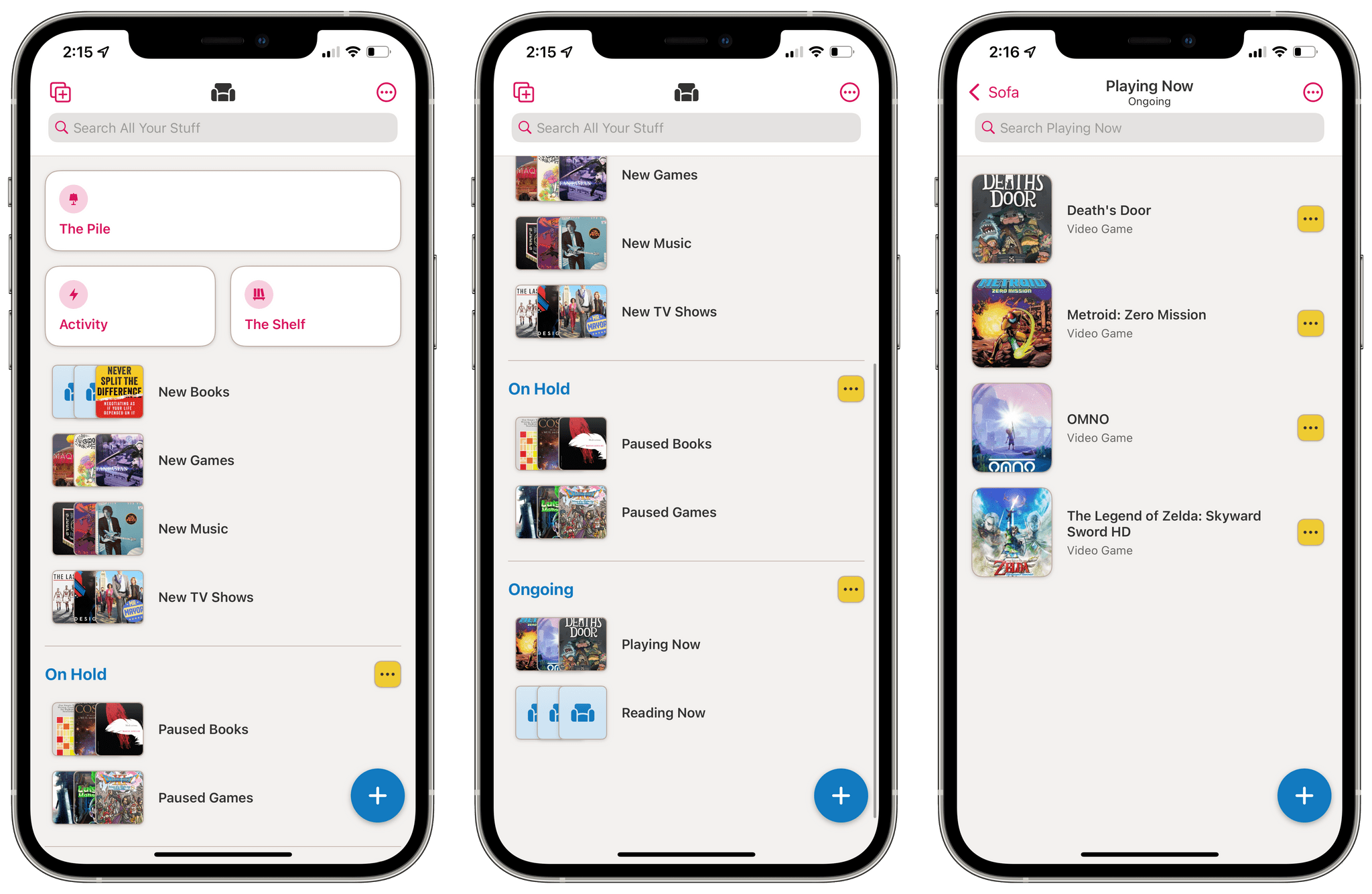
In contrast, Federico has split his Sofa lists between three Groups. There’s a collection of ‘new’ media discoveries that aren’t part of a Group followed by ‘On Hold’ and ‘Ongoing,’ the purpose of which is self-explanatory. He also isn’t currently using the shelf and is using a light, brightly-colored theme called ‘The 80s.’
Federico’s approach has an element of what I’m doing in that he, too, splits his content up into lists by media type, but instead of contextual sections, his lists are based on the status of his consumption. Is anyone surprised that Federico’s media list is essentially a task list? I’m teasing, of course. Federico’s approach is a great way to organize media when faced with so many choices of what to do next by maintaining a place for items he doesn’t want to forget about but won’t be able to start soon.
One thing I haven’t tried yet that I’m curious if any Club members are doing is mixing different kinds of media in the same list. It’s something that is supported by the app, but not an approach I think would work for the way I organize media, although I could see it working well with a status-based approach like Federico’s, collapsing his separate media-type lists into New, Ongoing, and On Hold lists.
In any event, if you’ve come up with an interesting Sofa scheme that you like, get in touch. I’d love to hear how other people are using the app.
INTERESTING LINKS
Great reads and links from around the web.
Substack is expanding its email newsletter business into territory that has been a traditionally strong category for Patreon: comics. (Link)
Last week there was an uproar over The New York Times changing its crossword puzzle file format and what that meant for third-party apps, but as it turns out, the change will not prevent users from solving their puzzles in Red Sweater’s Black Ink app, thanks to an update that Daniel Jalkut explains on the company’s blog. (Link)
A bipartisan bill was introduced in the US Senate this week, that if it becomes law, would require Apple, Google, and others that operate app stores to permit side-loading and to accept third-party payment systems. (Link)
AgileBits introduced an early access program for the upcoming release of 1Password 8 for macOS and took a lot of heat online for the fact that it’s built with Electron. (Link)
For a rundown of everything Samsung announced this week, including a new Wear OS watch and new foldable phones, don’t miss TechCrunch’s roundup. (Link)
Readwise, the web service and app for collecting highlights from eBooks and other sources, added automatic syncing with Obsidian this week. (Link)
Developer Simon Støvring has an excellent writeup this week on how he uses Camo by Reincubate to use his iPhone as a webcam. (Link)
APP DEBUTS
Noteworthy new app releases and updates, handpicked by the MacStories team.
Usage
Usage is a brand new Mac system monitoring app for your menu bar. The app is highly customizable, with options to add 13 different popover and 19 bar components that measure the status and charge of a Mac laptop’s battery, memory usage, processor load, network activity, disk capacity, and more. There are several apps that monitor similar metrics, but at $5.99/year or $8.99 lifetime, Usage is a good bargain for keeping an eye on the health of your system.
Tripsy
Tripsy, an excellent app for planning and organizing travel plans, got a small but significant update this week. The latest version allows you to add your plans to the Calendar app, complete with details like airline reservation codes, links to websites, phone numbers, and more. Of course, you can also share your calendar with family and friends who you may be visiting or who want to track your travels.
PairPlay Adventures
With PairPlay Adventures, two people share a set of AirPods (clean them first, folks). The app then plays a story part of which comes through the left AirPod, and the other part, which plays in the right AirPod. As the story develops, each person is instructed to interact in different ways with the other person. There are episodes starring robots, zombies, aliens, a polar bear, secret agents, and more. It’s a clever use of stereo audio, and the stories I’ve tried are lighthearted and fun, with a variety that will appeal to a wide audience.
HOME SCREENS
Friends of MacStories share their iPhone, iPad, and Apple Watch Home screens.
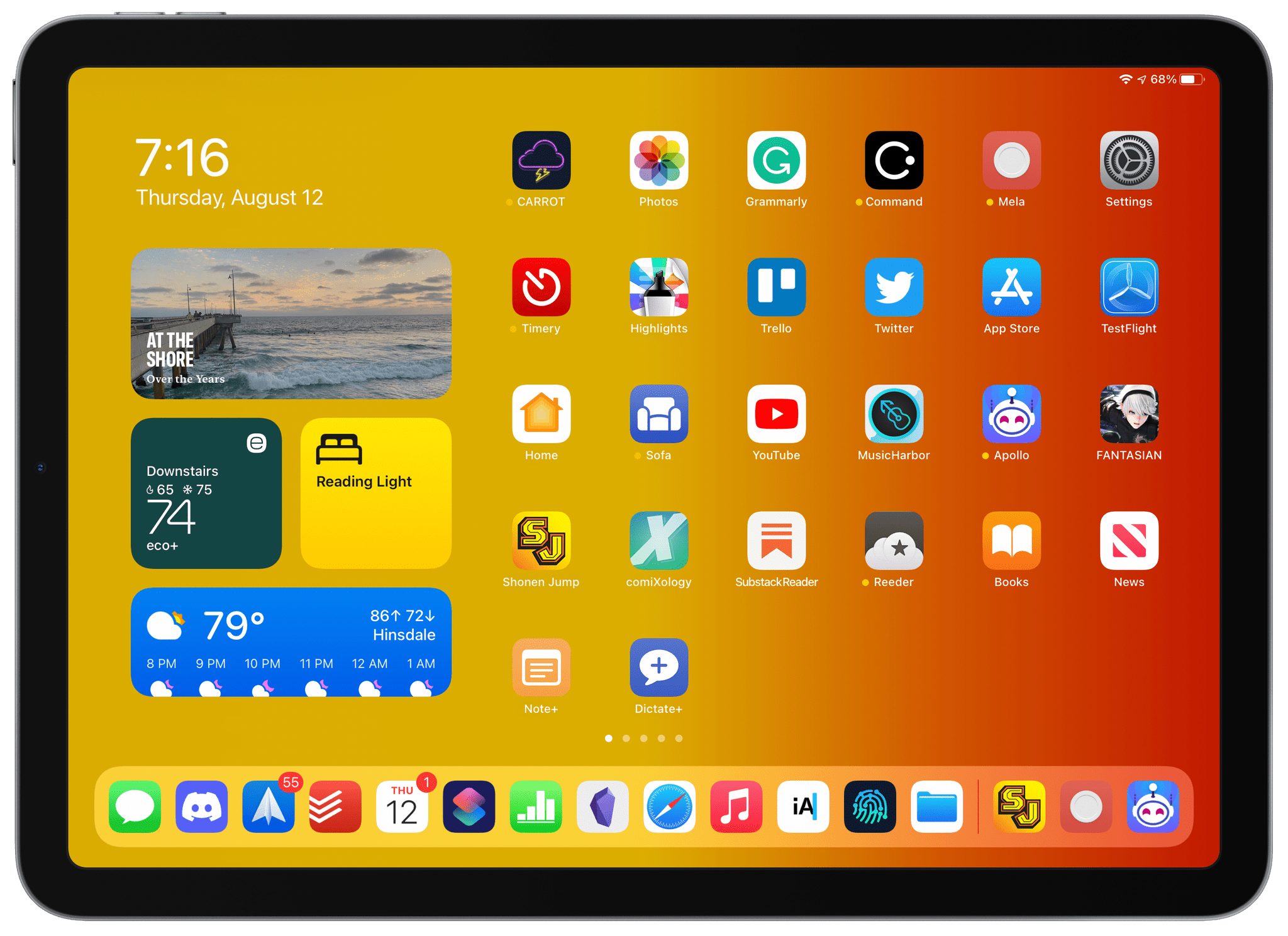
It’s been a long time since I shared a Home Screen. In fact, the last time was right after I wrote about the iPad mini. Since then, I gave up my beloved mini to my wife who had a much older model that broke. Not too long after that, I replaced my mini with an iPad Air. What’s interesting about the Air is that I use it more often, but generally for shorter periods of time than my 12.9" iPad Pro. The Pro is where I write and do other work for long stretches. However, it’s the Air that I grab to catch up on the news and social media, read, and do other lightweight work tasks. It’s a hybrid device that bridges work and downtime, which makes its Home Screen more interesting in many ways than either my iPhone or iPad Pro.
Widgets
The iPad Air is currently my fallback device for those times when I run into iOS or iPadOS 15 bugs, which is why it is still running iPadOS 14. I’ve been enjoying the XL widgets coming to iPadOS 15 on my iPad Pro, but I’m not sure I’ll use them on the iPad Air because I’m quite happy with a simple layout of two medium and two small widget stacks.
The medium-sized stack at the top of the widget column has four widgets: Photos, an Up Next Calendar widget, battery charge status, and Deliveries. These are widgets I use on all of my devices because most of the time, I find them more convenient than opening their apps or Control Center in the case of battery status.
The first small stack on the left includes two Ecobee Smart Thermostat widgets because we have separate heating and air conditioning for the first and second floors of our house. I find myself tweaking the temperature fairly often, and getting a quick glance of the temperature upstairs before going to bed is a handy way to be sure it’s comfortable before I call it a day. The other stack includes three HomeRun widgets that I use a lot in the evening: one turns the light on my bedside table on and off, and the other two are dedicated to turning off my office lights and the lights by our back door, both of which I frequently forget to turn off until I’m already in bed and want a quick way to make sure the lights are off.
The final stack includes a CARROT Weather forecast widget, two Netatmo Weather widgets that report data from the Netatmo indoor and outdoor weather, humidity, air quality, and sound sensors I use, plus a Timery widget for the currently running timer. The Timery widget may seem out of place, but if it’s the evening and I’m no longer working, at some point, I often check the weather for the next day and flip past the Timery widget giving me a chance to stop a timer that I may have left running.
From the description of my widgets, you have probably gathered that I use the Air in bed a lot, which is true. It’s the iPad I pull out to read a little when I’m taking a break during the day, play a game now and then, or check my email or other messages. However, it’s also the iPad that I always turn to in the evening to unwind.
The Dock
You’ll notice that my iPad Air’s dock is full of apps that I’d classify primarily as work apps. I don’t adhere to the same app layout for both of my iPads’ Home Screens, and their docks aren’t identical either, but the docks have more in common than other parts of their Home Screens. When I’m working on the Air, I’m more likely to be using apps in Split View, and I move from one app to another more often, so having my core set of work apps in the dock and in a similar order as my iPad Pro helps me work more efficiently.
Messages anchors the dock on the left because I’m in the app a lot every day, whether it’s communicating with friends and family or coordinating MacStories projects with Federico. Discord replaced Slack in my dock late last year because we’ve moved the management of MacStories to it, which has worked out well for us. I’m in several other Discords unrelated to work and haven’t found the mix to be problematic ever since I turned off all notifications, except those from the MacStories team. I’m also currently using Spark for email. I’m not a fan of any email app, but Spark’s message sharing feature and the ability to save messages links in Todoist or other apps makes it my best option at the moment.
I’ve switched task managers a lot in the past year or two, and the latest one I’m using is Todoist. The app’s quick task entry that uses a combination of natural language and its own syntax makes putting tasks where I’ll remember to do them fast. Plus, I want to give Federico’s Obsidian/Todoist integration scheme a try soon.
The next three apps are Calendar, Shortcuts, and Numbers. With the Up Next widget installed, I’ve debated moving the Calendar app out of my dock, but I don’t have anything else I really want to put in its place at the moment, and with a MacStories schedule that tends to change a lot from day to day, it’s often handy to grab Calendar from the dock and put it into a Split View with Messages as I work out dates recording our podcasts and scheduling other calls with Federico. Shortcuts is a no-brainer for my dock since so much of the work we do at MacStories is tied to it, and I spend a lot of time in Numbers tracking advertiser schedules and payments, so it gets a dock spot too.
After getting off to a slow and skeptical start with Obsidian early this year, it’s really grown on me. The mobile app has come a long way since its early betas, and after discovering the Minimal theme, which gives the app a more native feel, it’s become the place where I write and take notes. I don’t follow any particular note-taking system, but the flexibility of viewing multiple documents in separate panes, moving blocks of text between notes, and adding links between them has made it far easier for me to stay organized and able to access everything I’m working on quickly.
I spend a big part of every day in Safari between the services we use to run MacStories and research for stories, and Music is a mainstay on all of my Apple devices. Both apps get thousands of hours of use every year, which is why they, too, are in my dock.
The final three apps in my dock are iA Writer, Working Copy, and Files. I write less in iA Writer now that I’m using Obsidian, but for the time being, its integration with file providers makes it and Working Copy the best way to collect the materials written for our Club MacStories newsletters and copy them as HTML, which gets pasted into Mailchimp. Files plays a frequent role in a lot of iPad-centric projects too, which is why it gets the final spot in my dock.
Everything Else
The rest of my iPad Air’s Home Screen is a mishmash of research and entertainment apps with a heavy emphasis on reading. I find that the 12.9" iPad Pro isn’t very comfortable for reading for long stretches, and while not quite as perfect for reading as the iPad mini, the Air is still an excellent reading device. My reading apps are:
- Reeder, where I read RSS feeds and stories I’ve saved in its Read Later service
- Apple Books, because it’s my favorite way to read ebooks
- Apple News, which gets demoted to another page when current events become a stressful distraction
- Apollo for Reddit
- Twitter for the hottest takes
- Substack Reader for Substack newsletters
- Shonen Jump for manga
- Comixology for comics
I don’t read a lot of books, manga, or comics, but I keep apps for each on my Home Screen as a reminder to dip into each now and then for a change of pace. Substack Reader is a web app, but I subscribe to six newsletters, and reading them all in one place is better than digging through my email inbox.
The other entertainment apps on my Air’s Home Screen are MusicHarbor for discovering new music releases from my favorite artists, YouTube for unwinding with mindless video some nights, and Sofa for keeping track of all the media I’m in the middle of or going to try next. I suppose it’s notable that there aren’t more apps for video services on my Home Screen, but if I’m going to watch a movie or TV show, I prefer to do that on my TV or if it’s going to be on an iPad, I’ll use the Pro. Fantasian is also on my Home Screen because I like to keep a game or two that I want to play on my Home Screen as a reminder to give it a try when I have some downtime, and with the update to Fantasian out today, it’s next on my list.
Apple’s Home app is on the Home Screen of all my devices to make accessing cameras, lights, and other devices easy, especially when I’m in bed at night and want to check that doors are locked, and lights are off. Photos gets a spot on my Home Screen, too, for easy access to screenshots I take for stories I’m writing and browsing through photos I’ve taken. I’ve also got a beta for an app called Mela by the developer of Reeder, which is a recipe app that I’ve been trying and will be available soon, and CARROT Weather, so I can dig deeper into the week’s forecast if I want.
The rest of my Home Screen has a few work-related apps like Grammarly for grammar and spell checking of stories I write and Command Browser, which is a fantastic web browser for research that allows you to highlight and annotate webpages, and then export them to other apps, such as Obsidian. I’ve also got Trello for organizing Club MacStories newsletters, Timery for tracking my work time, and Highlights for marking up PDFs. Also, the App Store and TestFlight are on all my Home Screens because I spend so much time using them in connection with reviews I’m writing, and I keep Settings on my Home Screen because every time I move it to another page, I realize I use it too often for it to not be on the first page.
To wrap things up, I’ve got two simple Home Screen shortcuts in the bottom row of my iPad Air’s Home Screen, which are related. The first ‘Notes+’ prepends a typed note to an ‘Inbox’ note I keep in Obsidian, and the second one does the same thing but via dictation. A third related shortcut that isn’t on the Home Screen because it works via the share sheet takes anything else Obsidian can handle and drops it into the same note.
Of all my devices, I’m happiest with this Home Screen right now. That’s in part because it gets used less for MacStories work. My iPhone and iPad Pro are both running iOS and iPadOS 15 and are where most apps I’m testing are downloaded. Add to that the fact that I’ve been working on a Mac almost exclusively all summer to get the best feel possible for Monterey, and the result is that those Home Screens haven’t been optimized in a while. Now that I’ve said I’ll share all of my Home Screens, though, I’ll be spending some time over the next several weeks cleaning up those devices, hopefully just in time for the release of iOS and iPadOS 15.
PREVIOUSLY, ON MACSTORIES
Our top stories from the past week.
Billie Eilish and Apple Music Promote Spatial Audio with Short Film
Apple Maps for iOS and iPadOS 15 and macOS Monterey: The MacStories Overview
Things Adds Extensive Markdown Support and Search for Extended Notes Attached to Tasks
My Obsidian Setup, Part 1: Sync, Core Plugins, Workspaces, and Other Settings
UP NEXT ON MACSTORIES' PODCASTS
A preview of upcoming MacStories podcast episodes.
Next week on AppStories, Federico and John explore sideloading apps using AltStore.
This week on MacStories Unwind, Alex joins John to recap a week that included a story on Federico’s Obsidian setup, a deep dive into the Apple Maps updates coming to all of Apple’s platforms, and Things’ addition of Markdown support in Notes, plus other news and media picks for the weekend.

