The MacStories Team's iPhone Home Screens
THE EXTENSION
Exploring topics beyond our day-to-day coverage.
The MacStories Team's iPhone Home Screens
Federico’s Home Screen Setup

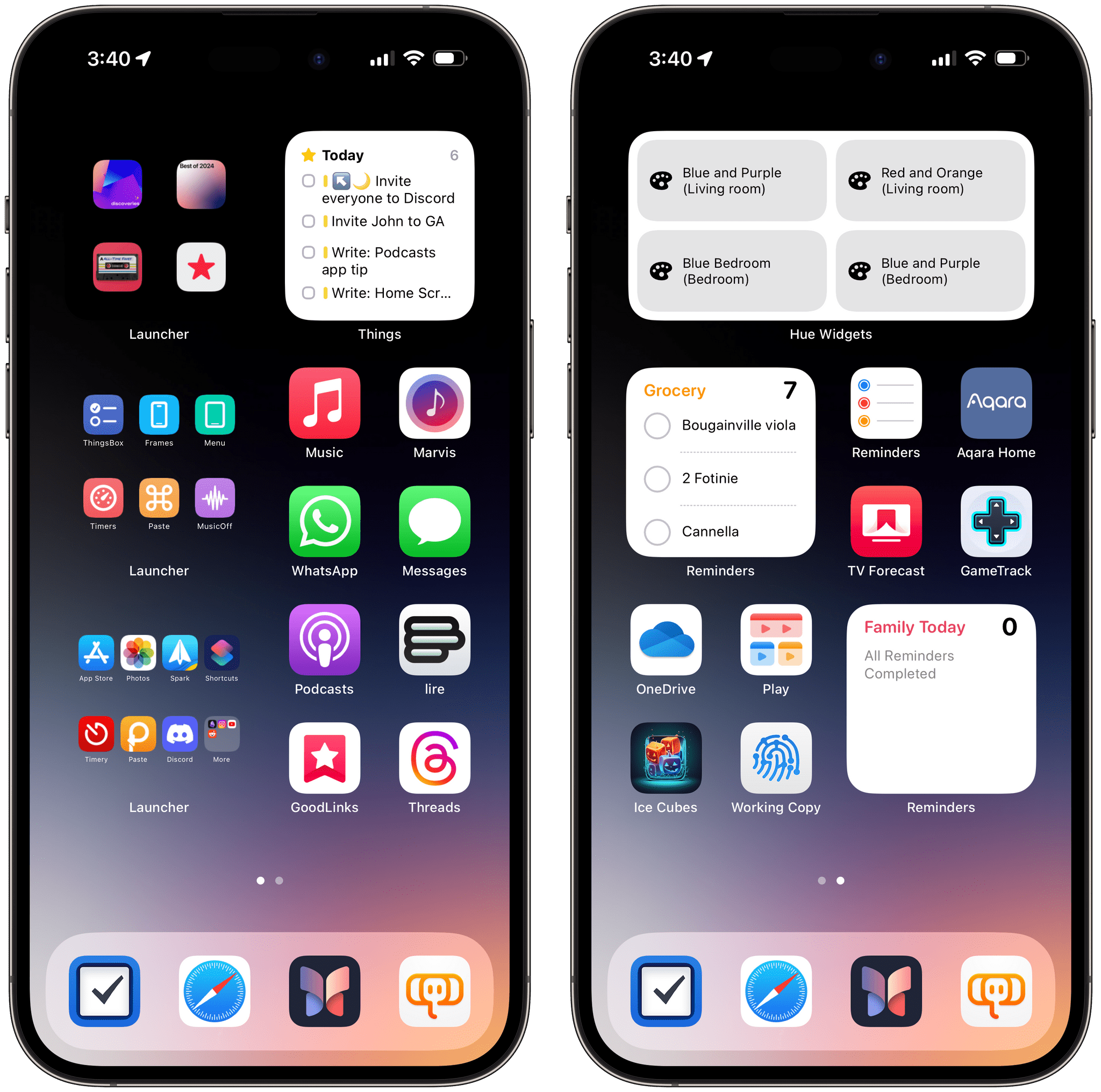
The latest version of my iPhone Home Screen is an evolution of the Launcher-based setup I described in Issue 399 of MacStories Weekly. There are some additions to the Home Screen, which I’ll highlight below, but, by and large, the layout hasn’t changed much over the past few months. I continue to like my simple, two-page approach that has everything I need – now with even quicker access to my favorite apps than before.
As I hinted a few weeks ago, I’ve rethought the left side of my main Home Screen with small Launcher widgets that allow me to run shortcuts and launch apps with a higher density that would otherwise be allowed by Apple. In the same space where Apple’s widget would let me pin two shortcuts with the small Shortcuts widget, I can put six icons with Launcher; in the same 2x2 grid that lets me put two app icons, I was able to add a small Launcher widget with 7 app icons, plus a “folder” I can navigate into directly from the widget thanks to iOS 17’s interactivity.
