Getting to Grips with the Camera Control and Photographic Styles
THE EXTENSION
Exploring topics beyond our day-to-day coverage.
Getting to Grips with the Camera Control and Photographic Styles

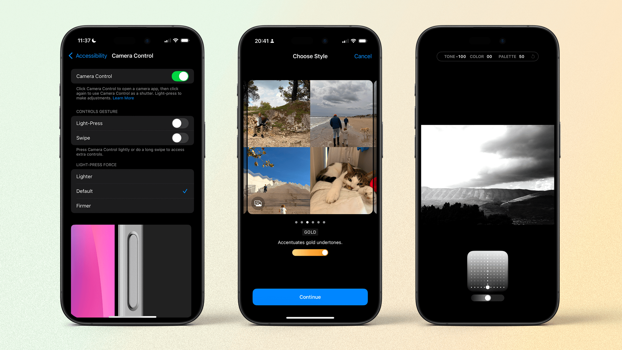
It’s been four weeks since the release of the iPhone 16 lineup. I’m also a week out from a holiday where I used the new camera features, both software and hardware, as much as possible. Now seems as good time as any for me to look at what those new features are, how I’m using them, and how you might consider re-examining the way you take photos in light of these changes.
Camera Control
Camera Control is the iPhone’s new hardware button (yay!) that’s super fiddly to use (boo!). It’s a noble attempt at recreating the classic shutter button on a traditional camera, but it falls over by being way too convoluted. Even beyond the complex swipes and half-presses, it also fails by being hard to find without looking because it’s flush with the edge of the iPhone. Additionally, while everyone’s hands are different, the button’s position along the side seems suited more to Salad Fingers (happy 20th anniversary; I feel very old) than the average user. It’s way too close to the middle of the device.
